Create a Custom Query
This page describes the elements that define a custom query and provides several examples of using the Query Builder to create custom queries.
Elements that Define a Custom Query
To create a custom query, you must specify the following elements:
- Aggregation function
- Metric
- Where Clause
- Group By Clause
- Legend
The sections below describe these elements.
Aggregation Function
Aggregation is a method of reducing the amount of data that SigNoz displays, and you can use it to identify patterns or outliers in your data. SigNoz allows you to perform both temporal and spatial aggregation.
Temporal Aggregation
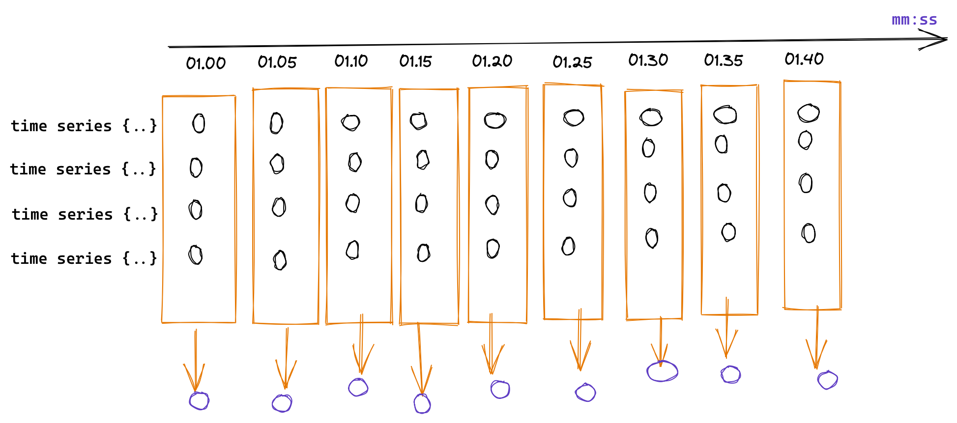
SigNoz re-aggregates into longer intervals the metrics you collect at a high frequency, allowing low-resolution time series to be pre-calculated or used in place of the original metric data. SigNoz auto-adjusts this interval based on the time range selected to limit the number of points it plots on the chart. The following example diagram shows the aggregation of data into ten seconds intervals:

Spatial Aggregation
If you collect a metric and you don’t need all the attributes, you can remove unwanted attributes. This way, your metrics will only have the attributes that you need. The following diagram shows the aggregation of the entire set of time series into a single value at each interval of time:
Supported Aggregation Functions
SigNoz supports the following aggregation functions:
- NOOP (No aggregation)
- COUNT (Number of values in each set of data)
- COUNT_DISTINCT (Number of distinct values in each set of data)
- SUM (Sum of all the values)
- AVG (Average of all the values)
- MAX (Maximum of all the values)
- MIN (Minimum of all the values)
- P05 (5th percentile of values)
- P10 (10th percentile of values)
- P20 (20th percentile of values)
- P25 (25th percentile of values)
- P50 (50th percentile of values)
- P75 (75th percentile of values)
- P90 (90th percentile of values)
- P95 (95th percentile of values)
- P99 (99th percentile of values)
- RATE (Rate of change of value for each time series)
- SUM_RATE (Sum of the rate of change of each time series)
- RATE_SUM (Rate of change on sum aggregated values)
- RATE_AVG (Rate of change on avg aggregated values)
- RATE_MAX (Rate of change on maa aggregated values)
- RATE_MIN (Rate of change on min aggregated values)
Metrics
Application metrics represent a characteristic of your application as a value at a specific point in time. For example, an application metric is the number of requests per second your application serves. SigNoz collects information as a sequence of data points every minute and then represents the data through time in a graphical form. The X-axis is time, and the Y-axis is the value.
You can use a where clause to specify the filtering condition for your query, enabling you to select only data that meets the specified criteria. SigNoz will only plot data for which the where clause evaluates to true, and it’ll exclude everything else. For example, you can use a where clause to plot only the HTTP requests from a service named foo that returned a 500 status code.
The following operators are supported:
INNINLIKENLIKE
Note that you can use the IN and NIN operators as an alternative for = and != with a single value.
Group By Clause
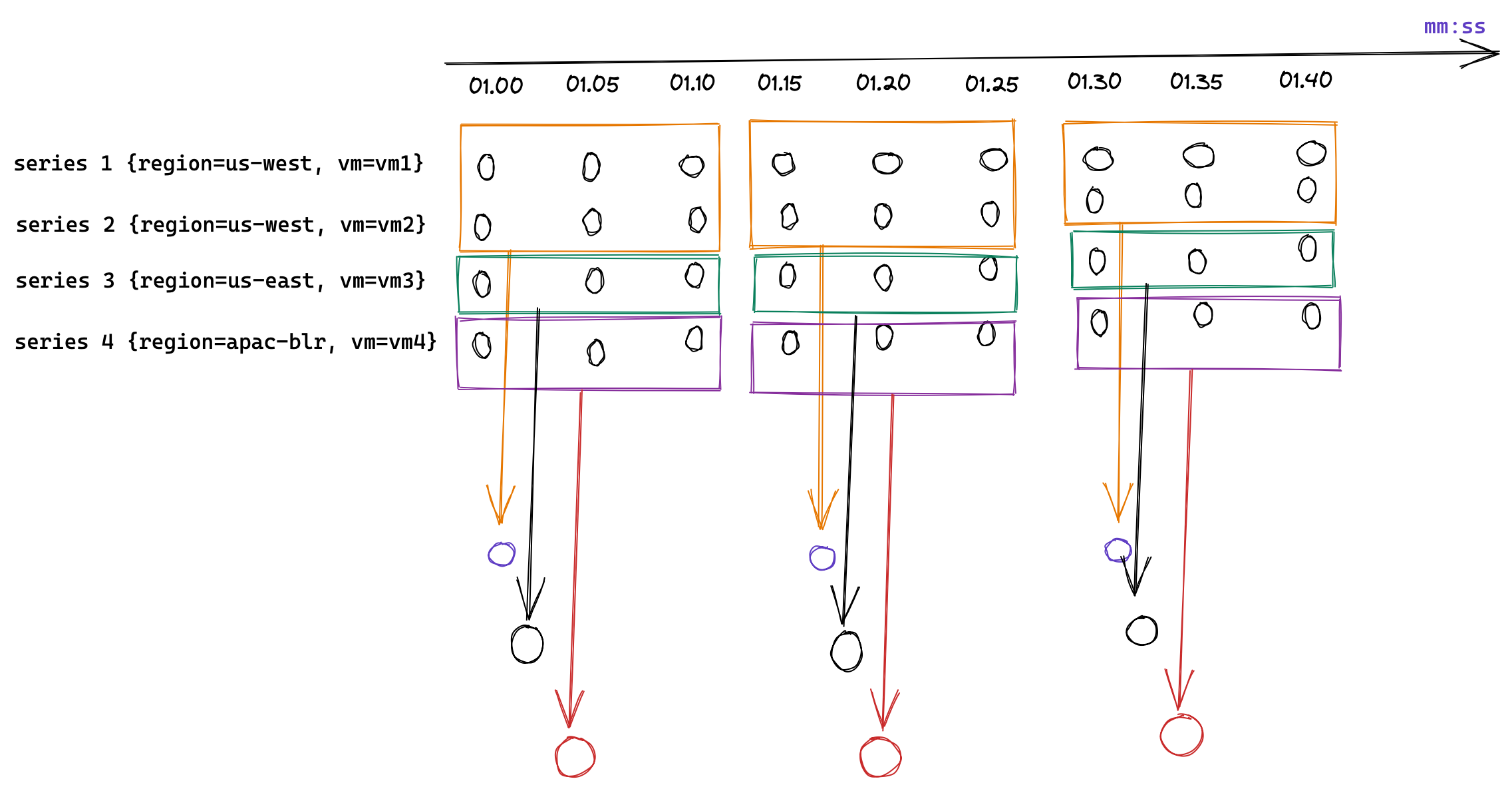
You can use the Group By clause to divide the results of your query based on the property you specify. The following example diagram shows how a Group By clause aggregates the same metric into separate groups, each group representing an AWS region:
Legend
Use the Legend text box to specify a legend name for your time series.
Examples
Writing PromQL or ClickHouse queries has a steep learning curve. The query builder is aimed at users who are not familiar with the Prometheus system or ClickHouse, and it allows you to write complex queries using an intuitive user interface.
This section walks you through the process of plotting graphs for different types of metrics. This will give you a good understanding of how to use the query builder.
Prerequisites
- The sections below assume that your application is already instrumented. For details about how you can instrument your application, see the Instrument Your Application section.
- The sections below assume that you are familiar with the basics of monitoring applications.
Configure Host Metrics
Use host metrics to monitor the resource utilization of the hosts on which your application is running. SigNoz collects metrics describing the utilization of various system resources, such as CPU, disk, and network. This allows you to correlate both performance issues and errors observed in your application to unusual host metrics.
CPU Utilization
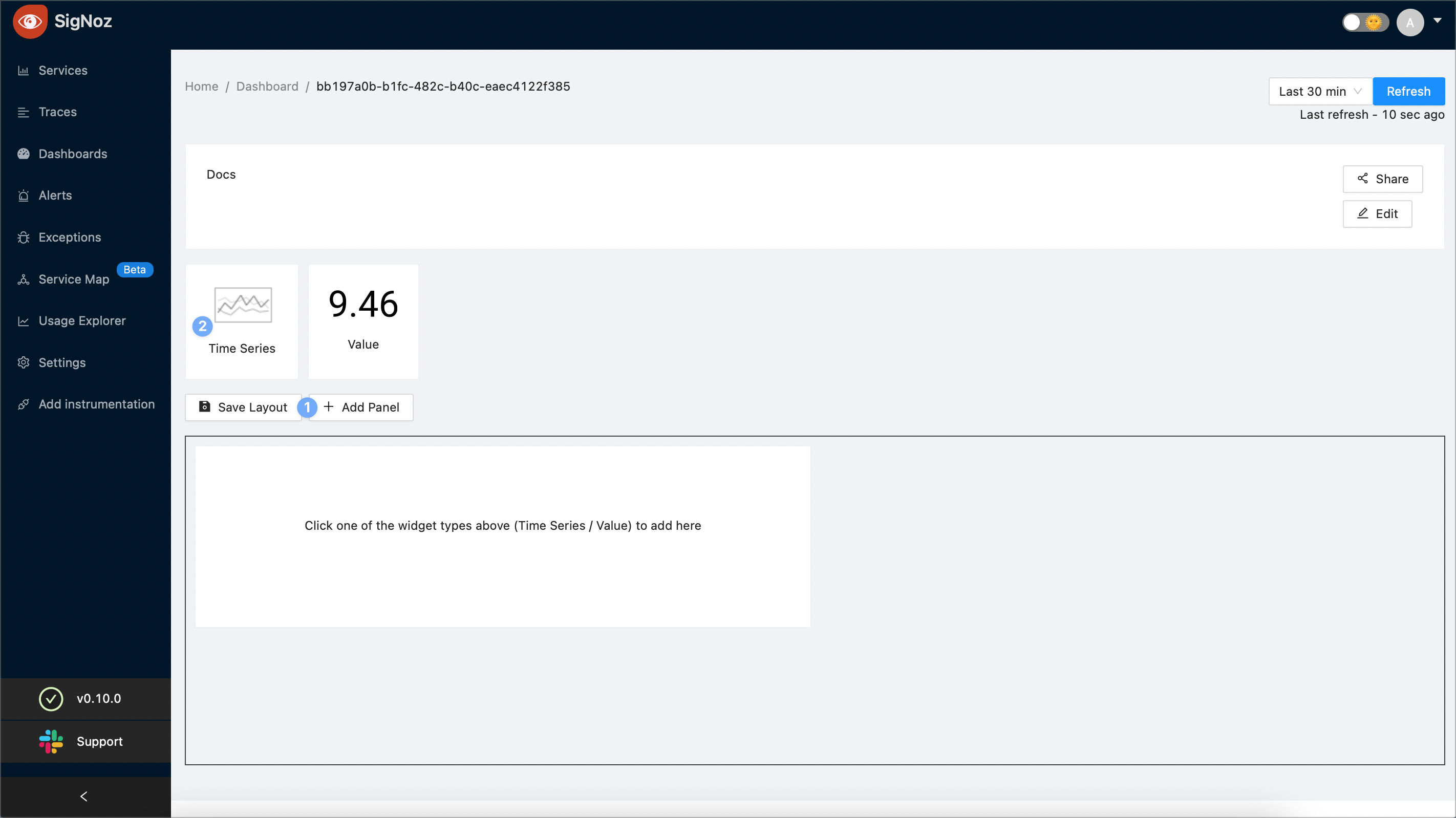
On a new or existing dashboard select the Add Panel button. Then, select Time Series:
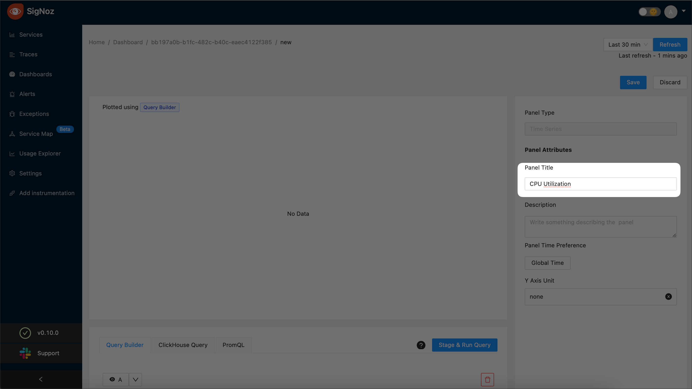
Enter the title of your new panel. The example screenshot creates a new panel named “CPU Utilization”:
Choose
RATE_AVGas the aggregate function: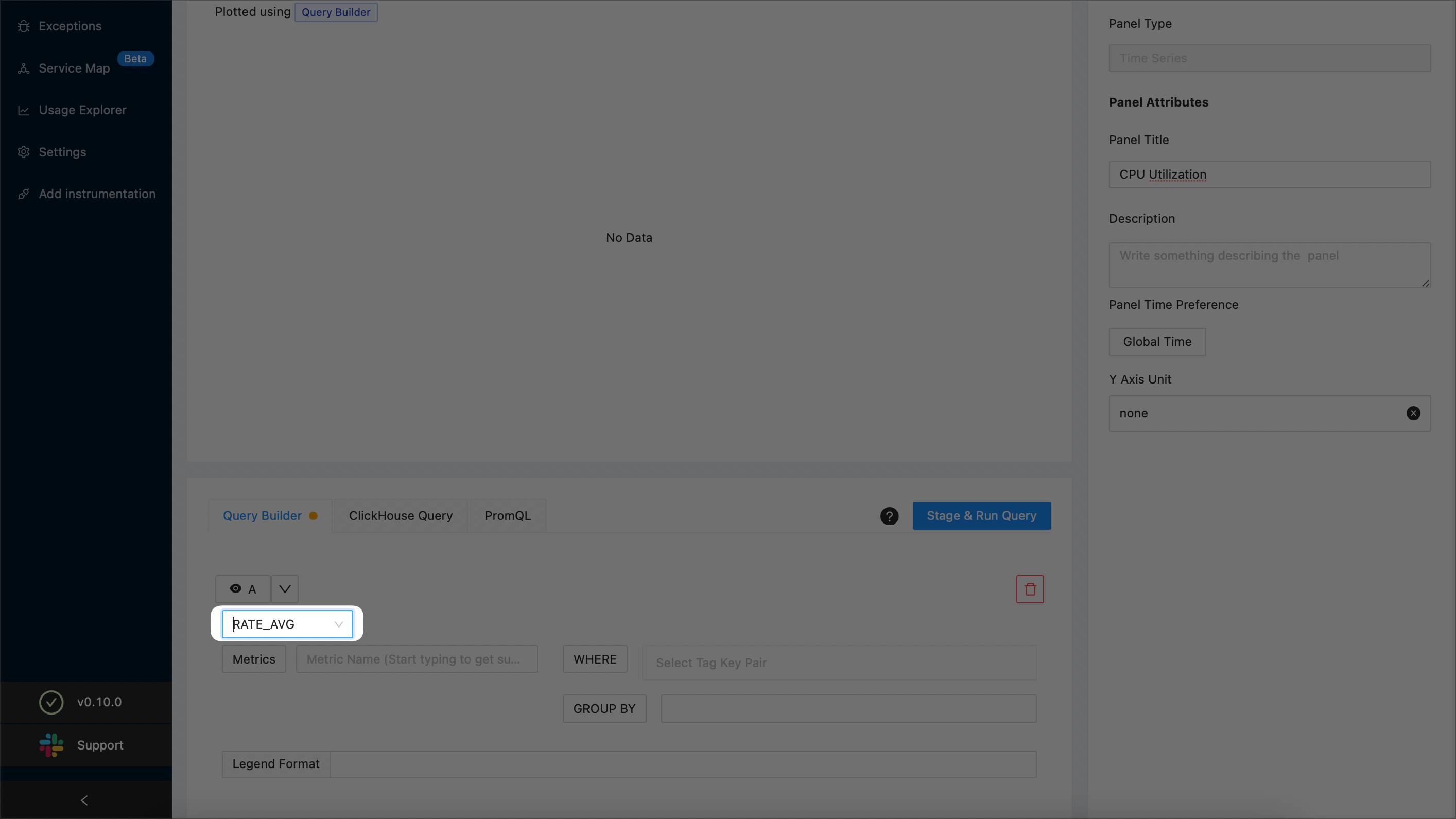
NOTE:
For details on aggregate functions, see the Aggregate Function section.
From the Metrics drop-down, select
system_cpu_time: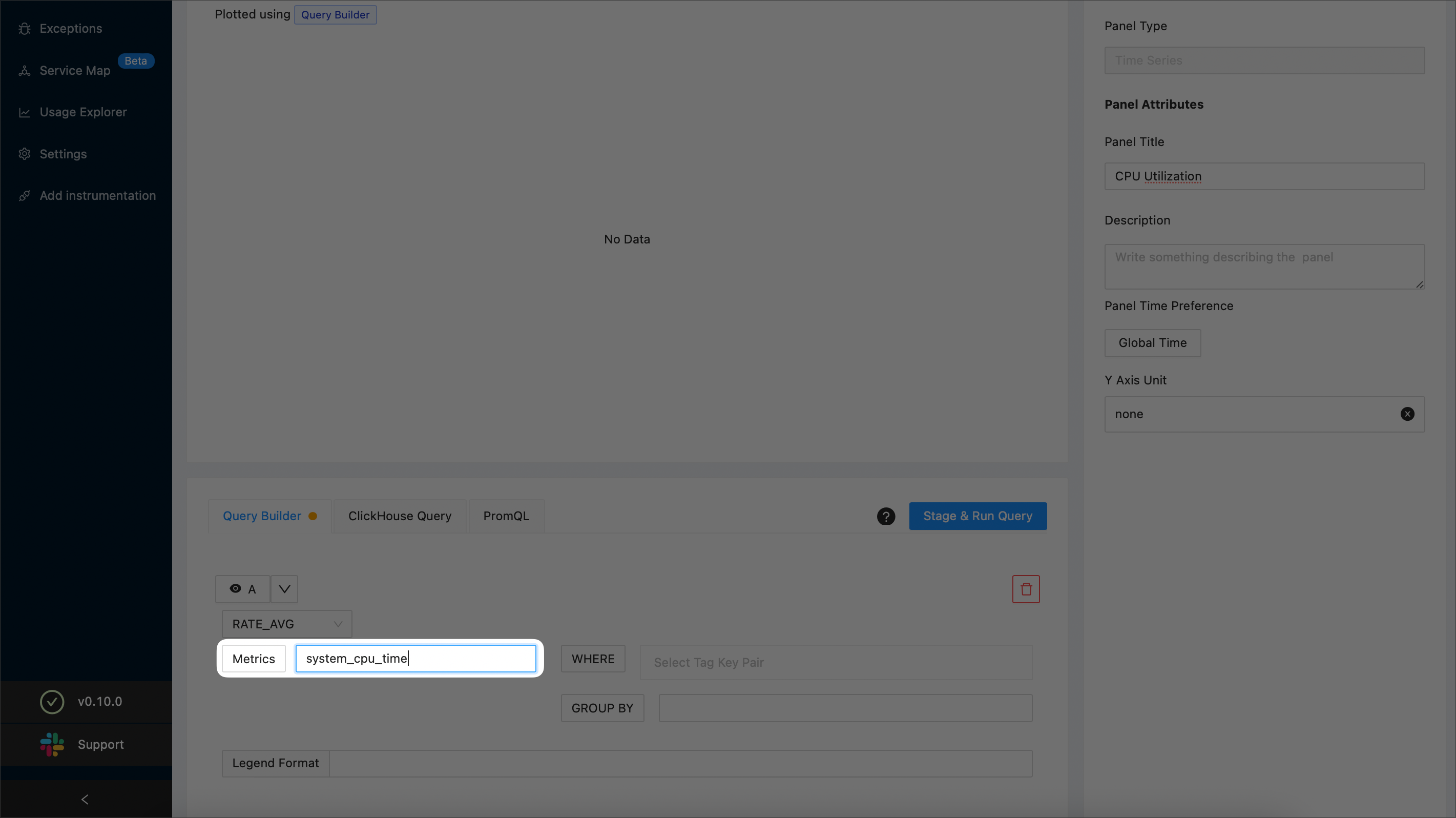
Specify that the state should not be
idleby adding a filtering condition as shown below: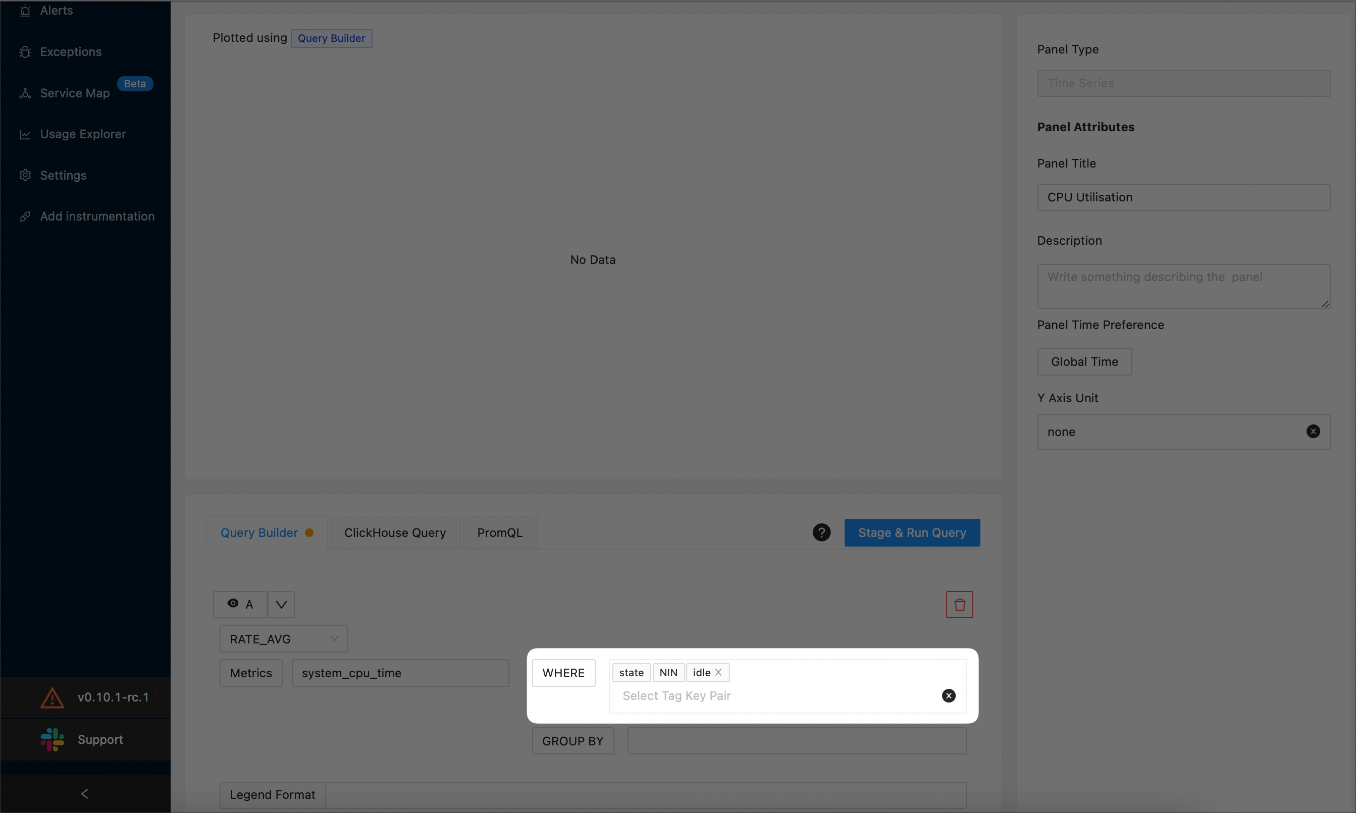
In the Legend Format text box, enter
{{state}}: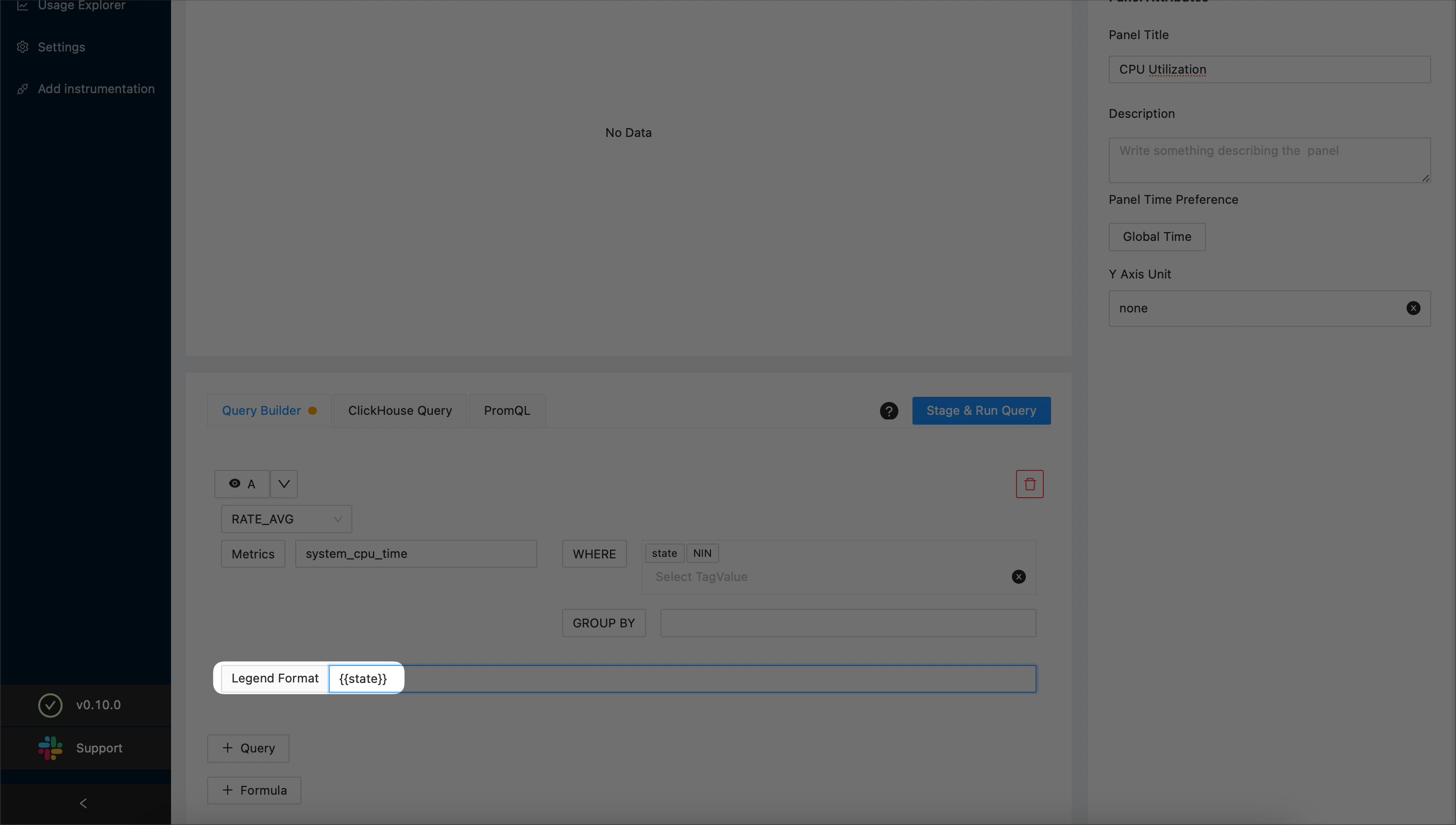
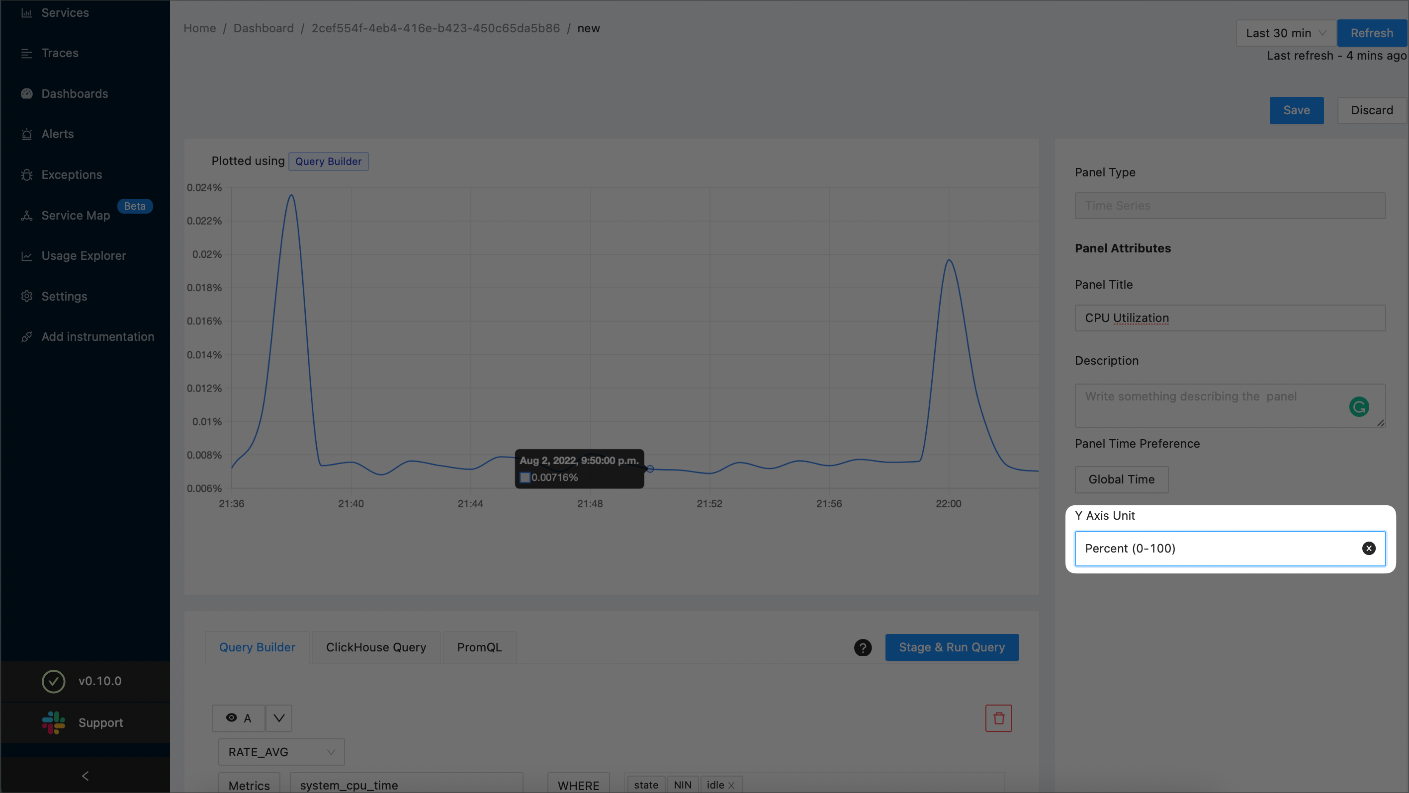
Use the Y Axis Unit dropdown to specify that the value displayed on the Y-axis is a percentage and can take values from 0 to 100:
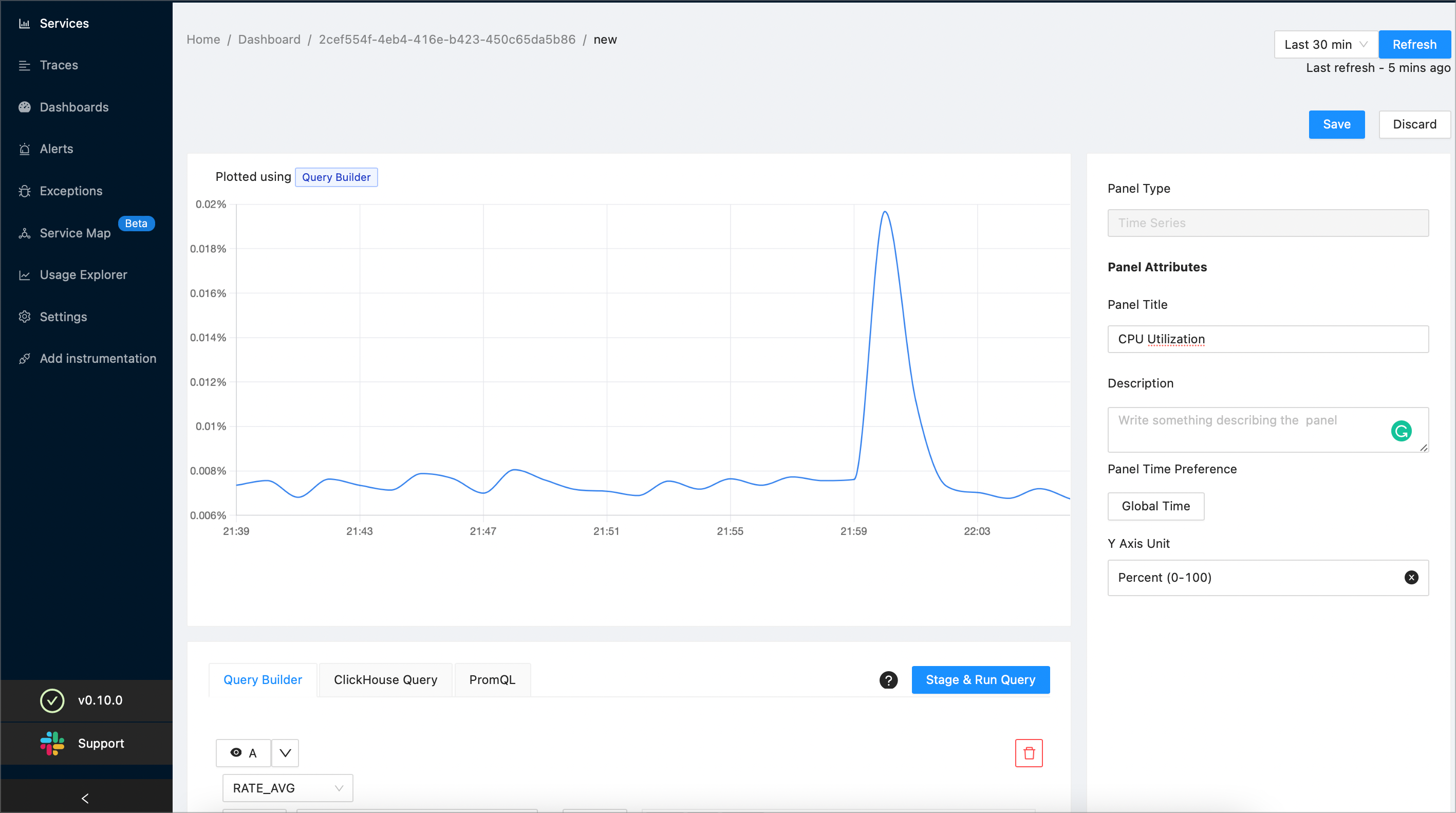
To preview your query, select the Stage & Run Query button. SigNoz will plot a graph similar to the following one:
(Optional) To further drill down, you can plot the a separate graph for each state by specifying
statein the Group By drop-down and selecting the Stage & Run Query button. SigNoz will plot a graph similar to the following one: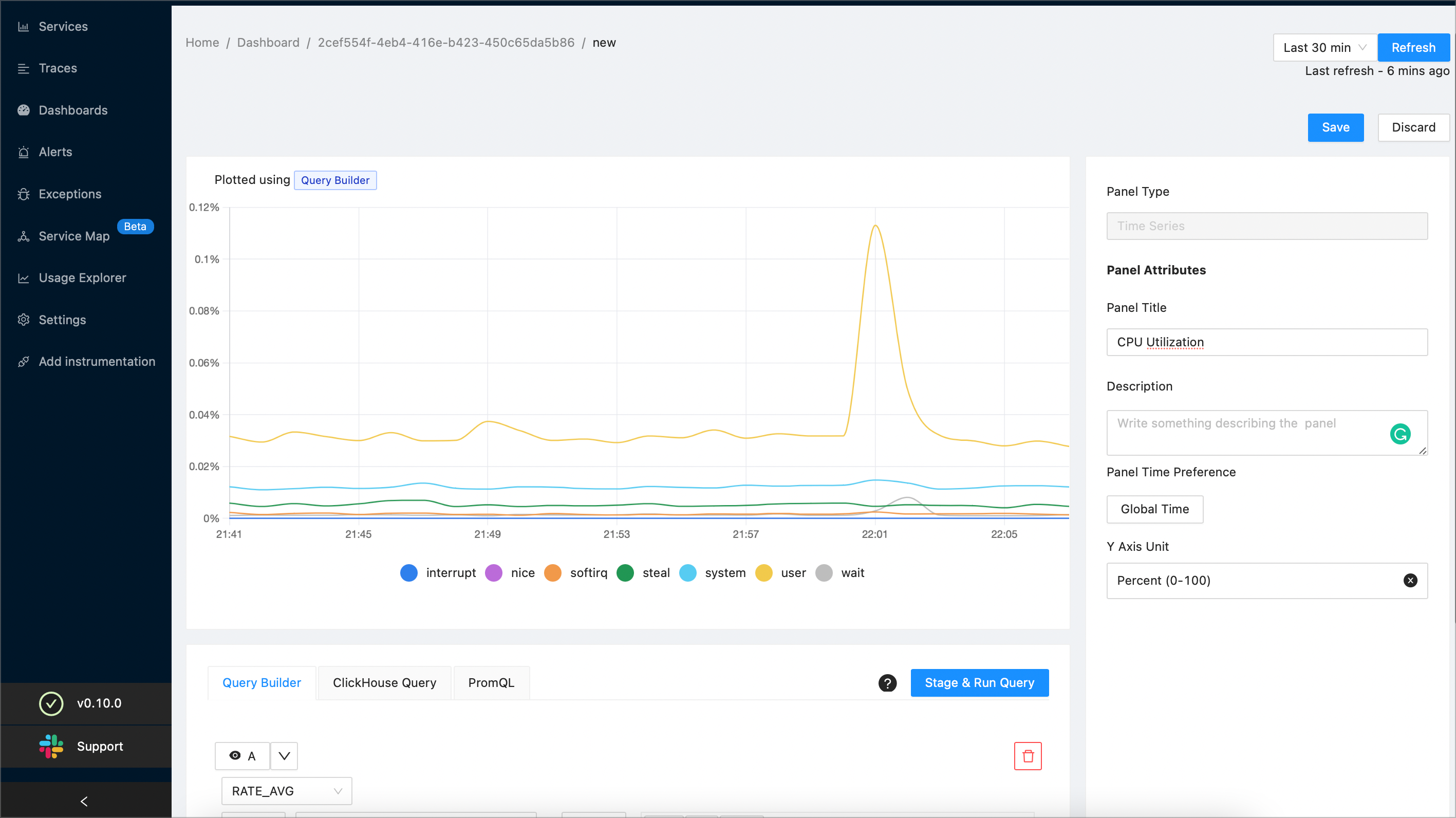
When you’ve finished, select the Save button at the top right corner of the screen. Then, select the OK button to confirm.
Disk Saturation
Disk saturation means the disk is often accessed, and applications usually must wait before being able to read or write data. Follow the steps in this section to build a panel that shows the disk saturation metric.
On a new or existing dashboard select the Add Panel button. Then, select Time Series:

Enter the title of your new panel. The example screenshot creates a new panel named “Disk Saturation”:

Choose
RATEas the aggregate function: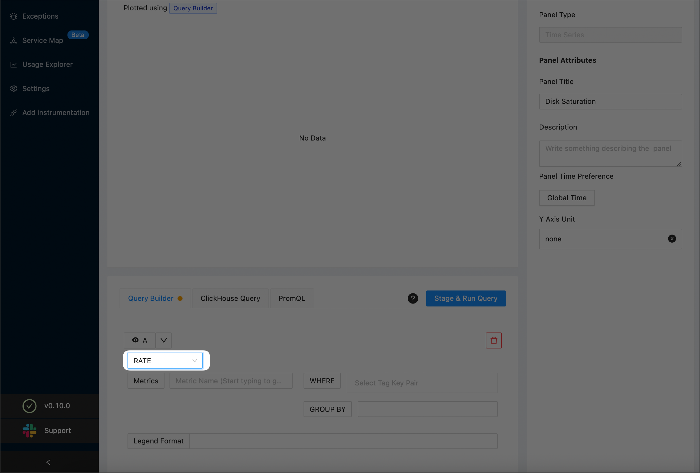
NOTE:
For details on aggregate functions, see the Aggregate Function section.
From the Metrics drop-down, select
system_weighted_io_time: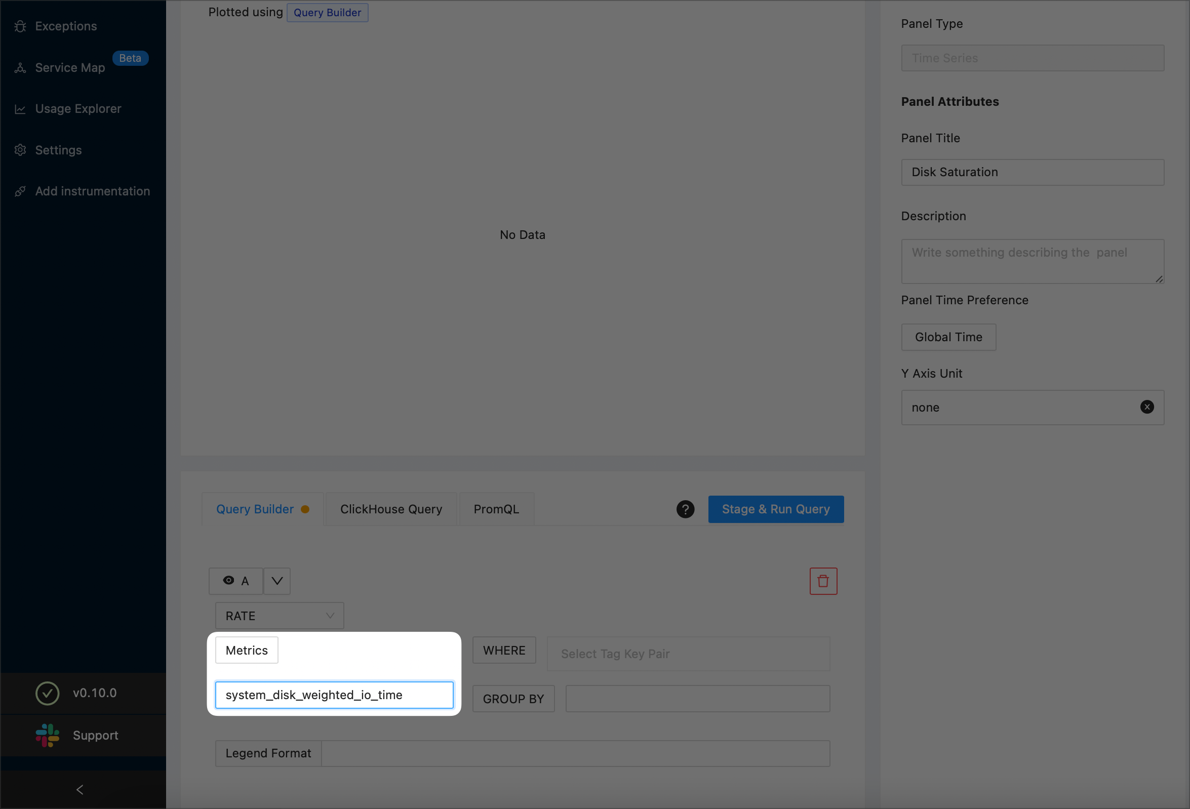
In the Legend Format text box, enter
{{device}}: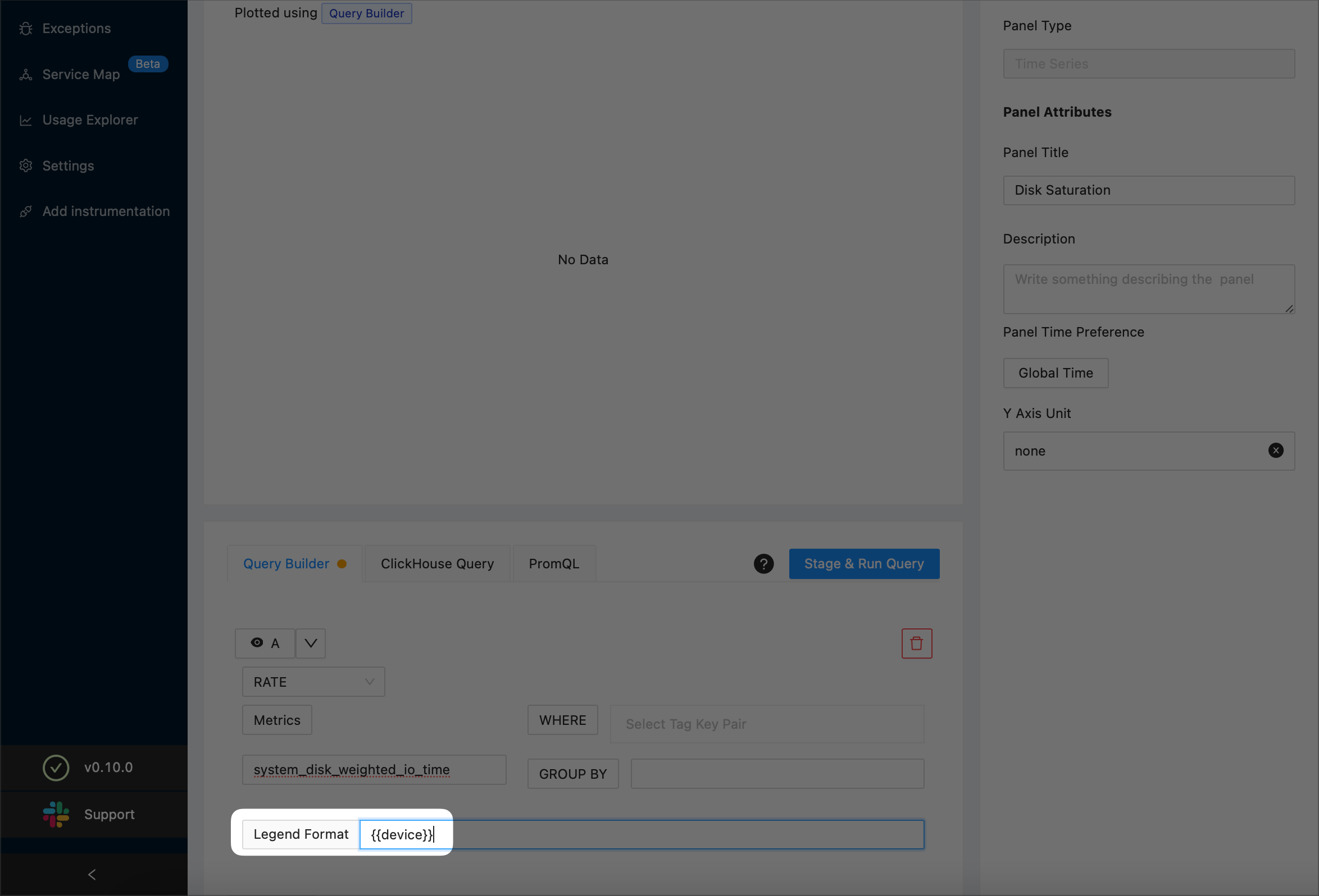
To preview your query, select the Stage & Run Query button. SigNoz will plot a graph similar to the following one:
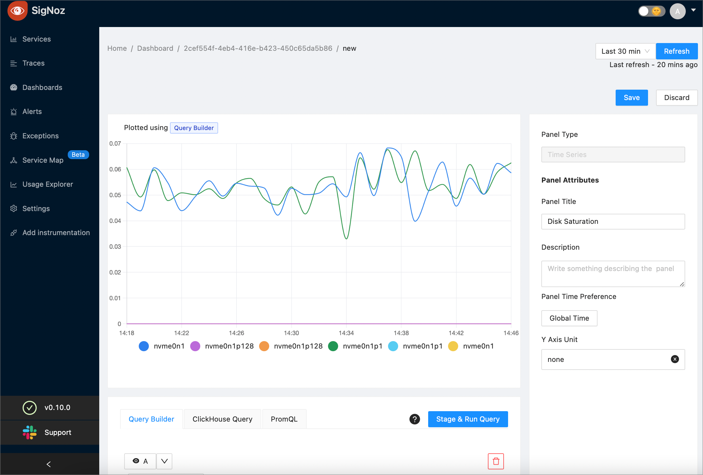
(Optional) To further drill down, you can plot the a separate graph for each host name by specifying host_name in the Group By drop-down and selecting the Stage & Run Query button.
When you’ve finished, select the Save button at the top right corner of the screen. Then, select the OK button to confirm.
Network Errors
On a new or existing dashboard select the Add Panel button. Then, select Time Series:

Enter the title of your new panel. The example screenshot creates a new panel named “Network Errors”:
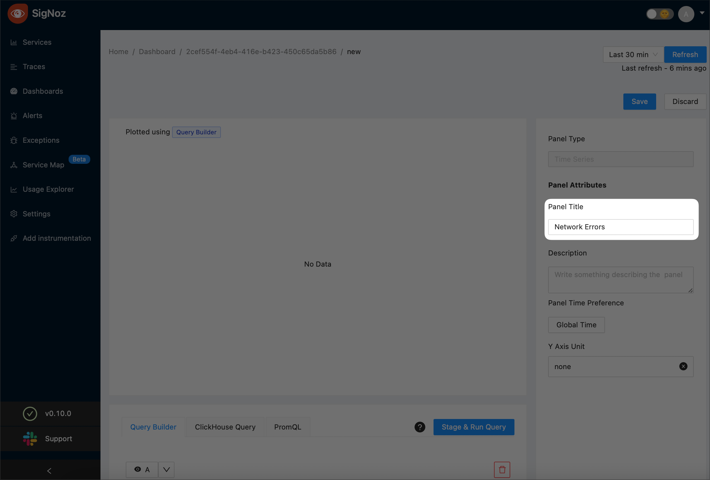
From the Metrics drop-down, select
system_network_errors: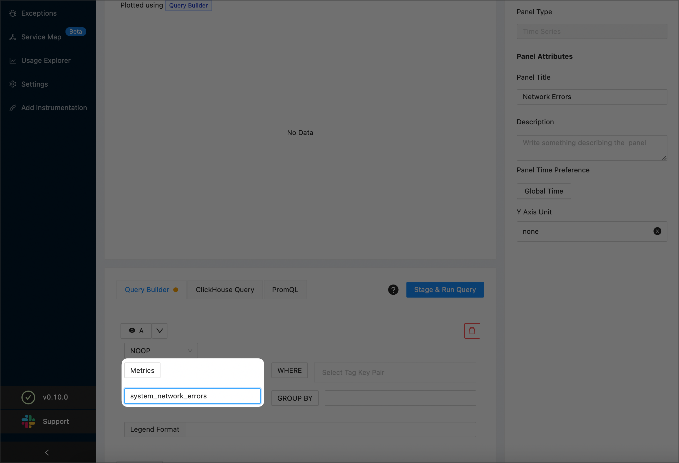
(Optional) Specify that you want to see the network errors for a specific host (this example uses
signoz-host) by adding a filtering condition as shown below: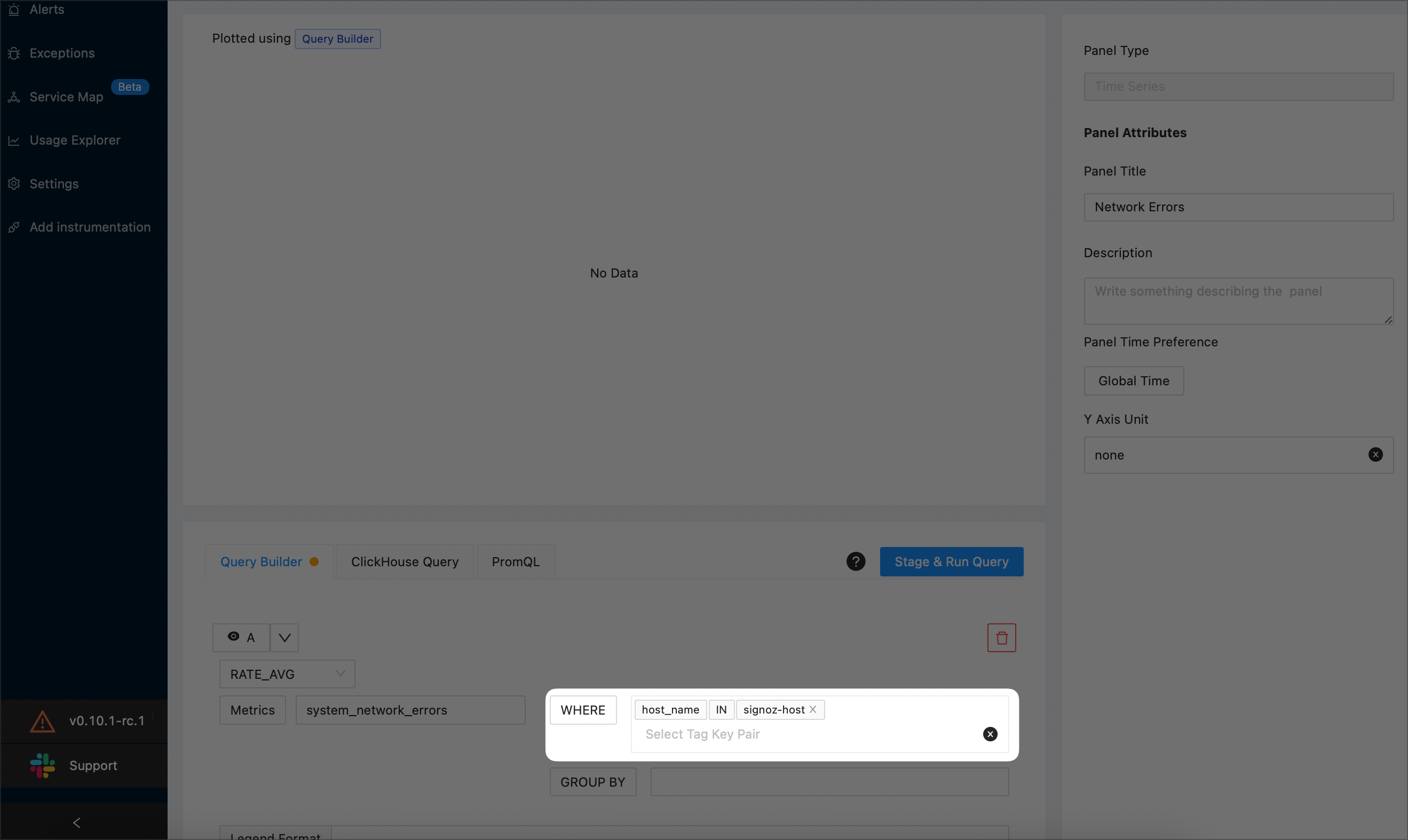
Note that, for each network interface, SigNoz plots separate time series for sending and receiving data. The example screenshot below shows a system named
signoz-hostwith two network interfaces (loandeth0):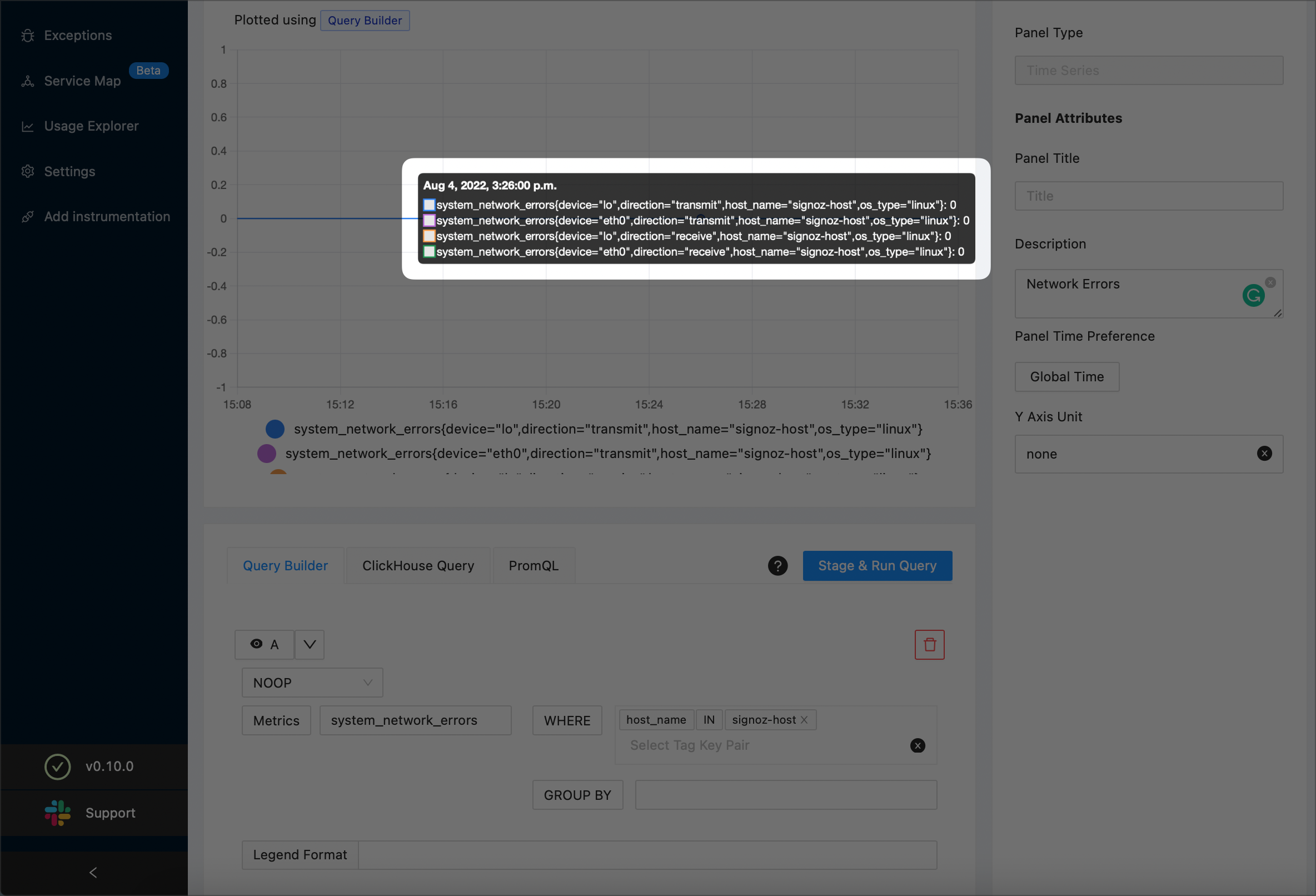
In the Legend Format text box, enter
{{device}}-{{direction}}: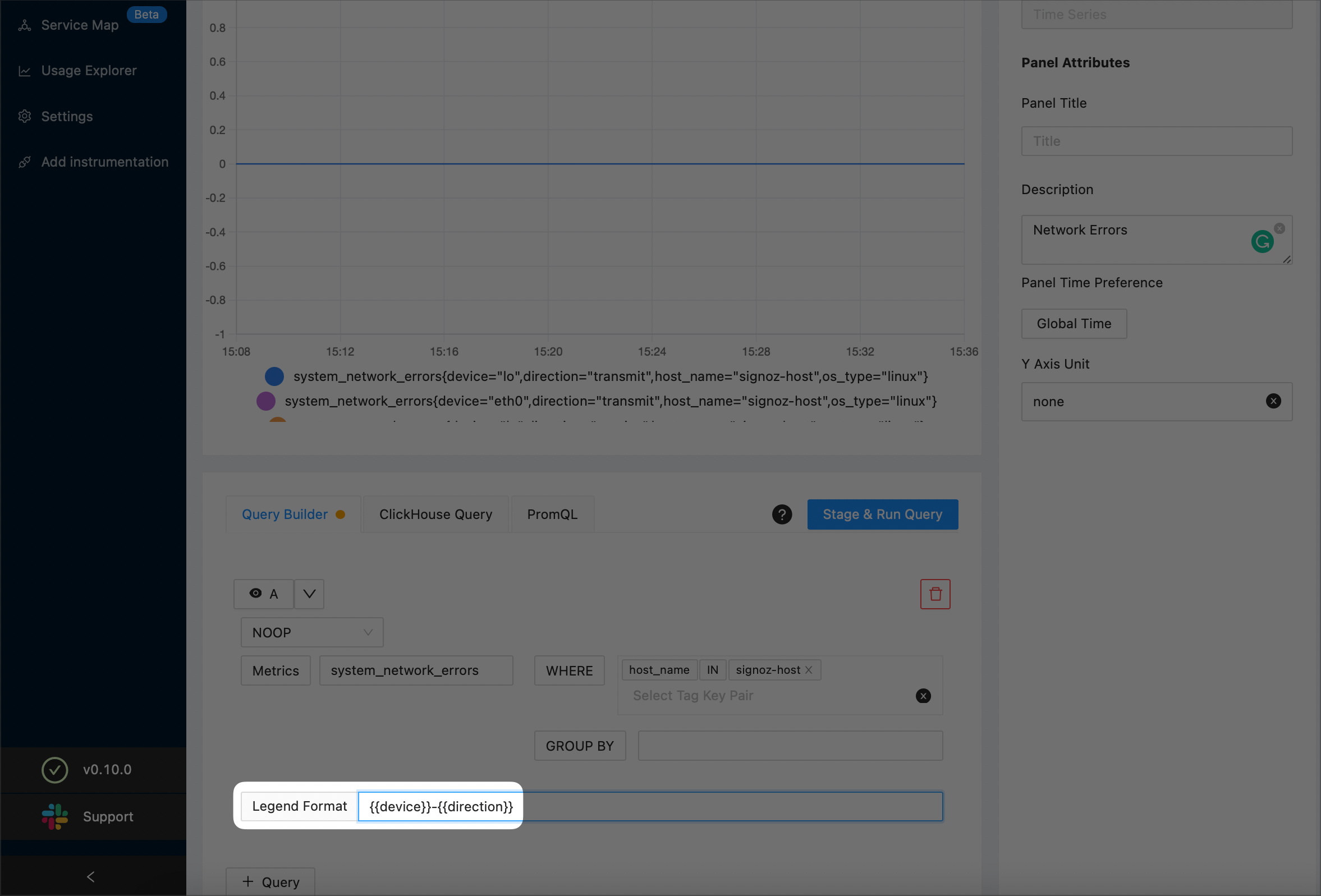
To preview your query, select the Stage & Run Query button. SigNoz will plot a graph similar to the following one:
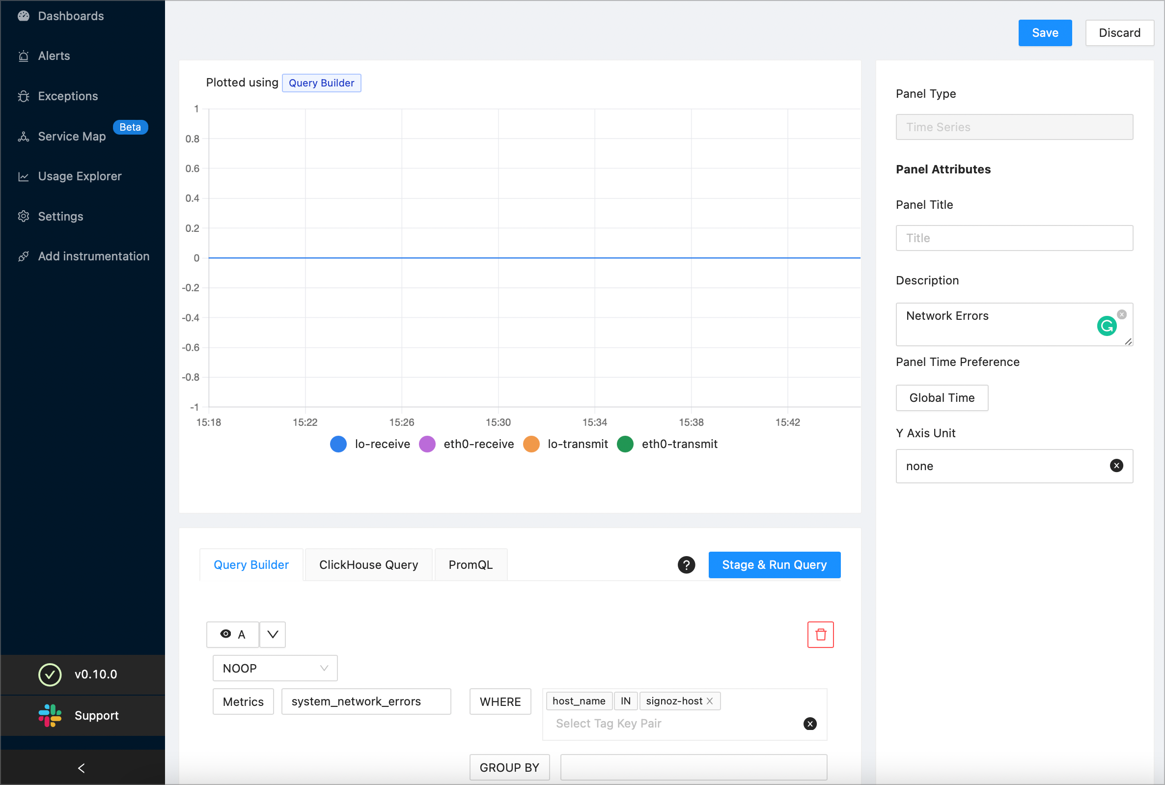
(Optional) To further drill down, you can plot the a separate graph for sending and receiving data by specifying
directionin the Group By drop-down and selecting the Stage & Run Query button.When you’ve finished, select the Save button at the top right corner of the screen. Then, select the OK button to confirm.
Configure Application Metrics
Use application metrics to monitor the performance of your applications and identify any potential problems. Examples of applications metrics are percentile response time, error rates, request rates, memory and cpu usage.
Request Rate per Service
The example in this section calculates the request rate per service for the SigNoz application, but the steps you’ll learn will help you calculate this metric for your own application.
On a new or existing dashboard select the Add Panel button. Then, select Time Series:

Enter the title of your new panel. The example screenshot creates a new panel named “Requests per Service”:

Choose
SUM_RATEas the aggregate function: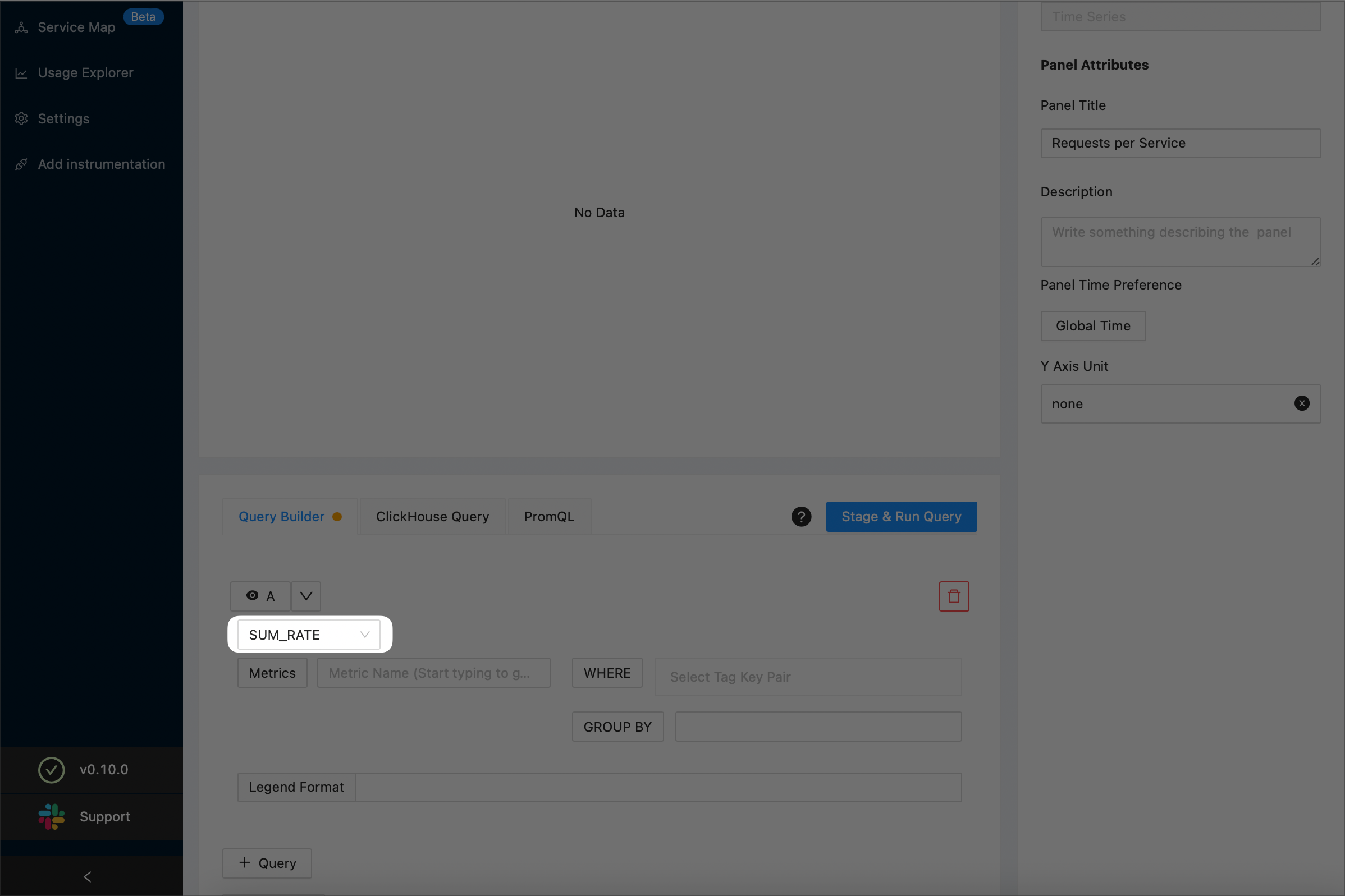
NOTE:
For details on aggregate functions, see the Aggregate Function section.
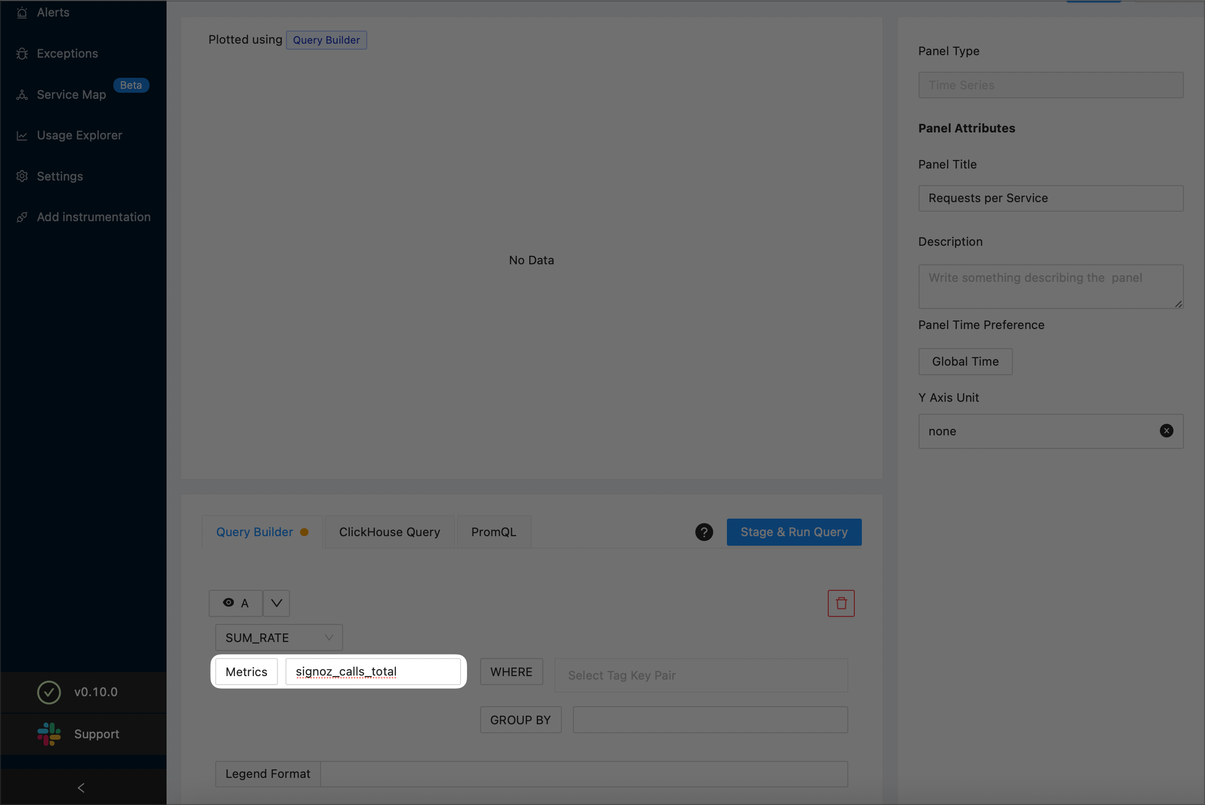
Use the Metrics drop-down to specify that you want to plot the total number requests made to your application. The example screenshot below plots the total number of requests made to SigNoz:
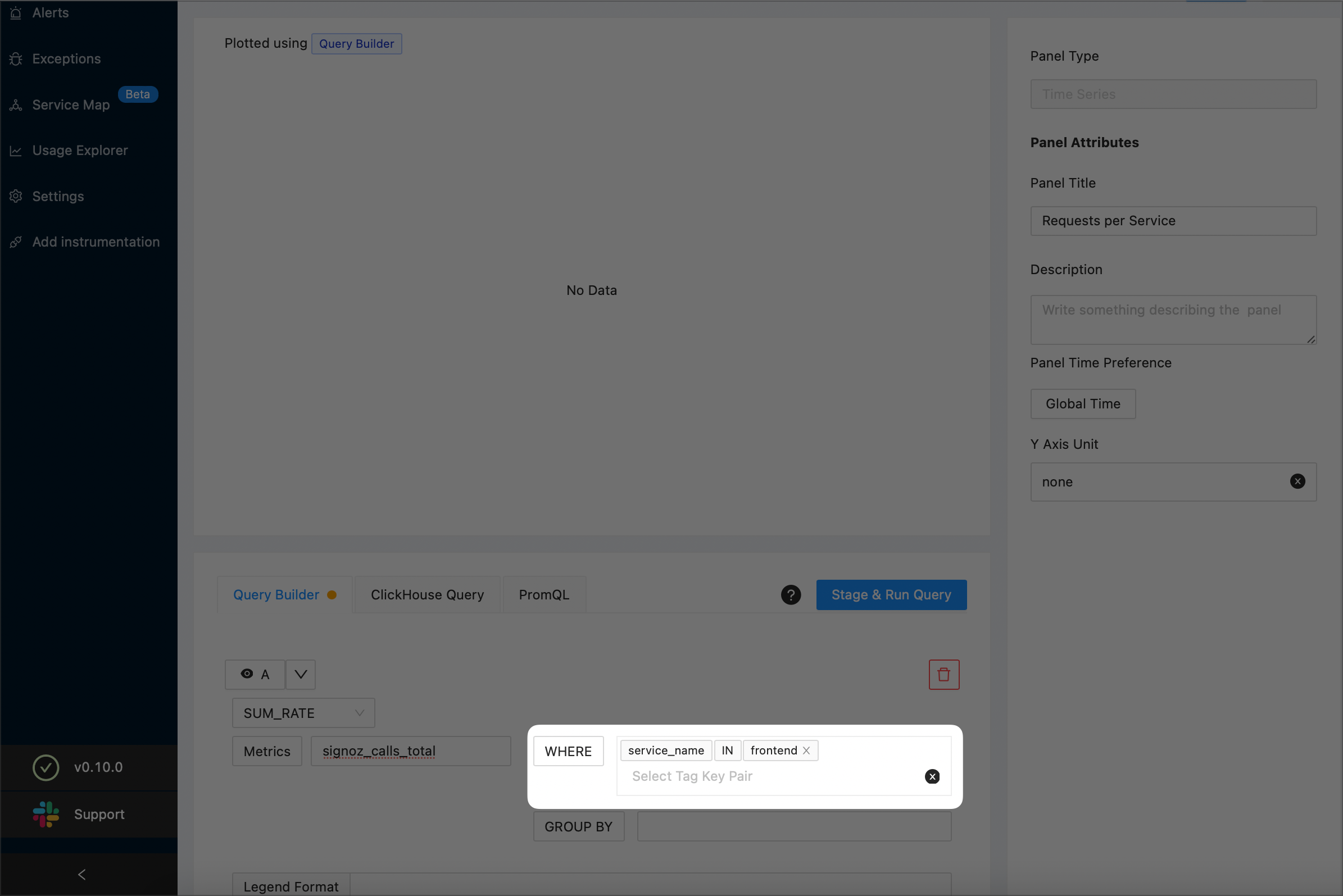
Specify the the services that you want to plot.
To plot a single service, add a filtering condition as shown below:
To plot all the services, choose
service_namefrom the GROUP_BY drop-down: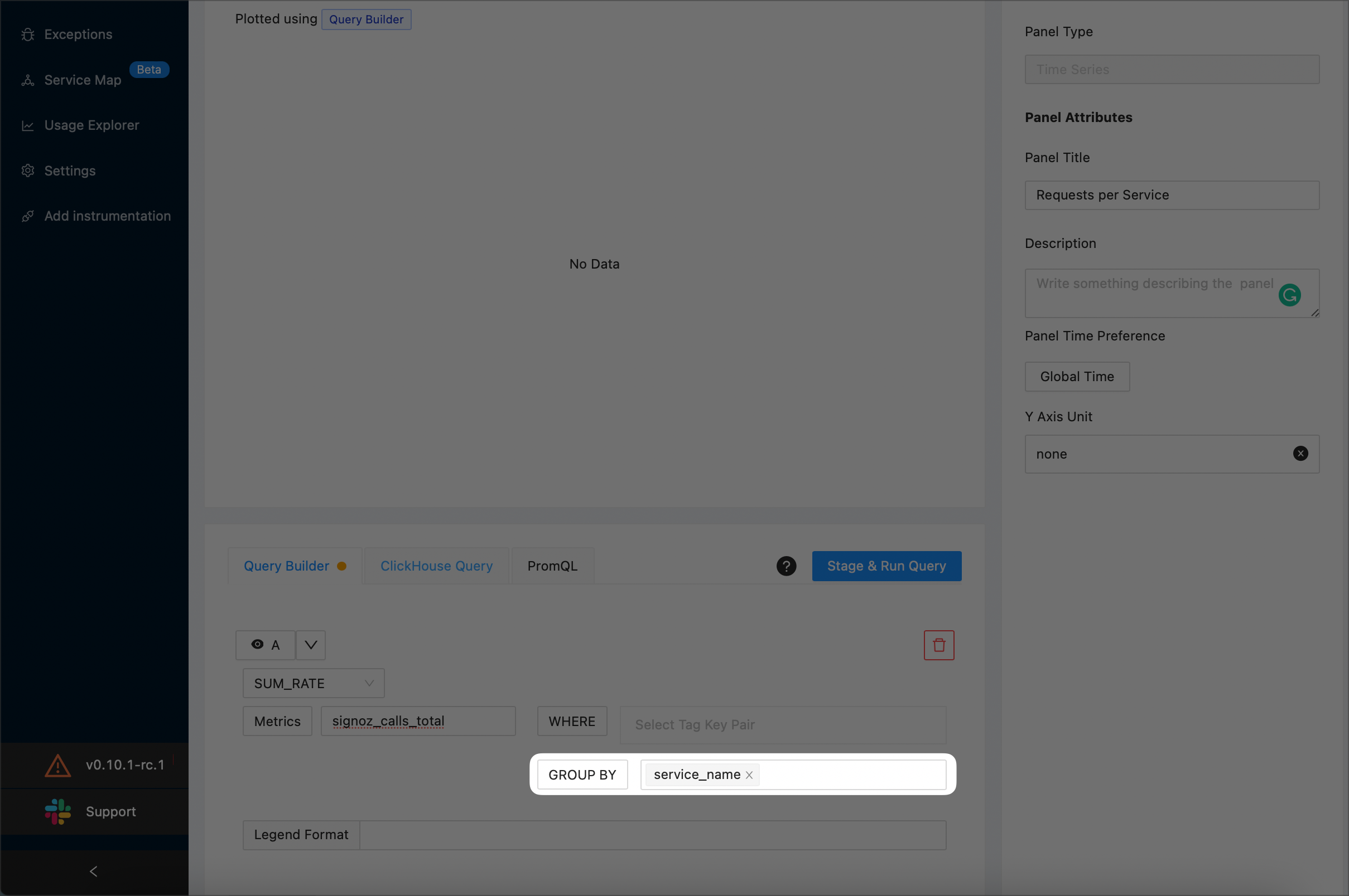
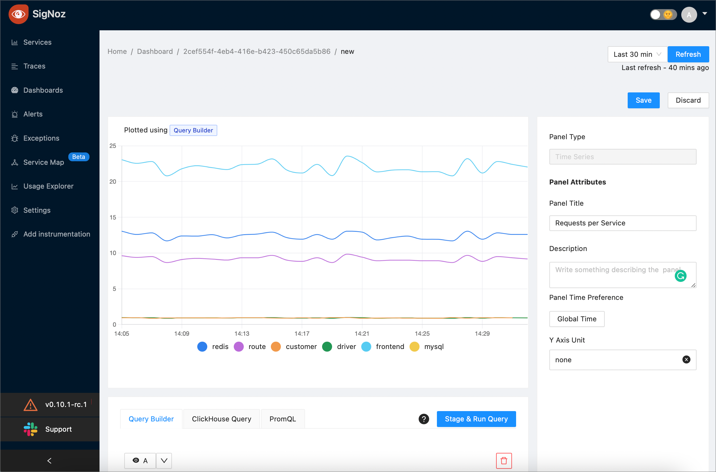
(Optional) If you are plotting all the services, enter
{{service_name}}in the Legend Format text box.To preview your query, select the Stage & Run Query button. SigNoz will plot a graph similar to the following one:
When you’ve finished, select the Save button at the top right corner of the screen. Then, select the OK button to confirm.
Average Latency per Service
This example plots the average latency per service using a formula based on two queries.
On a new or existing dashboard select the Add Panel button. Then, select Time Series:

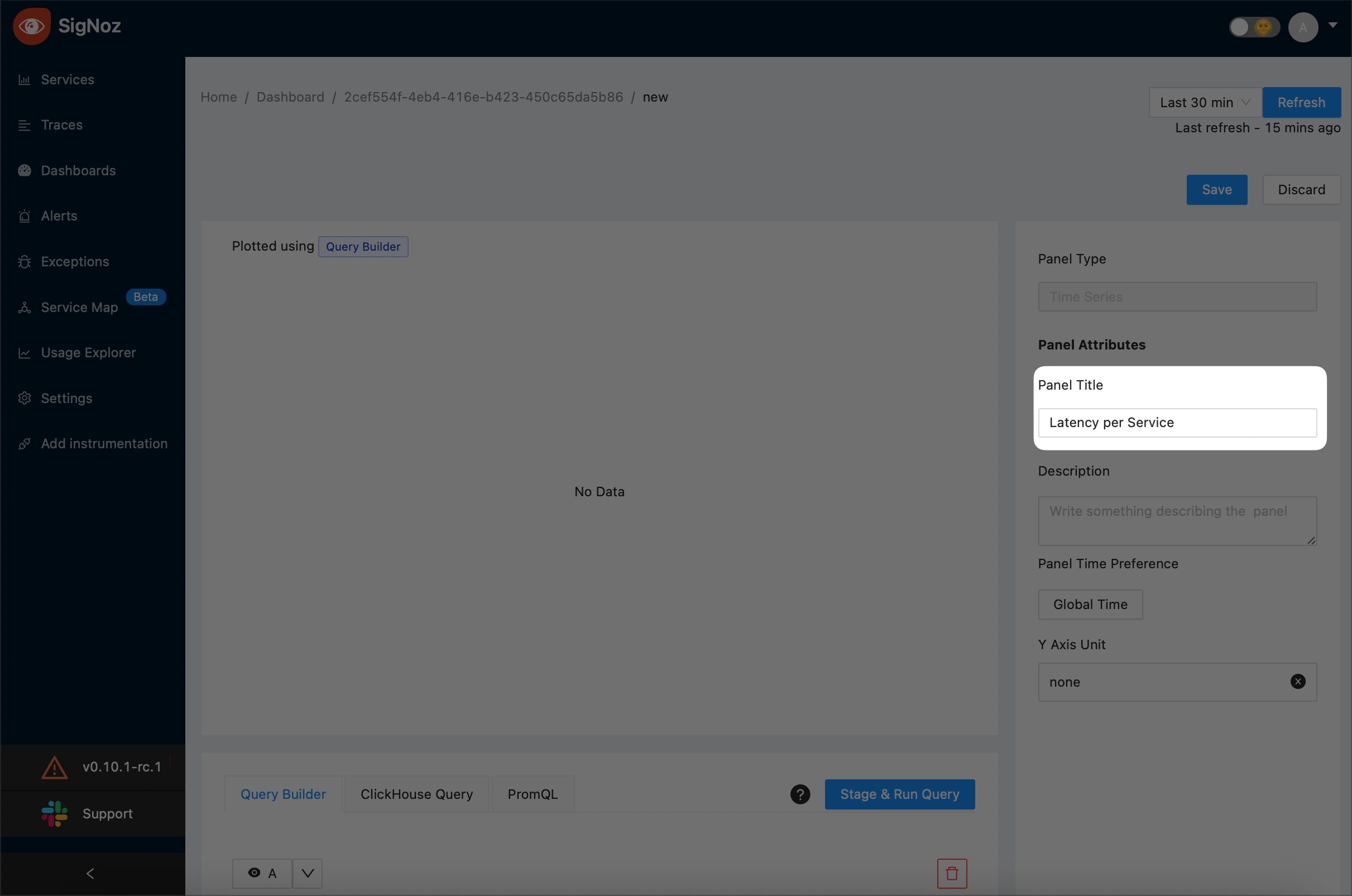
Enter the title of your new panel. The example screenshot creates a new panel named “Latency per Service”:
Specify the First Query (A)
3.1 Under A, choose
SUM_RATEas the aggregate function: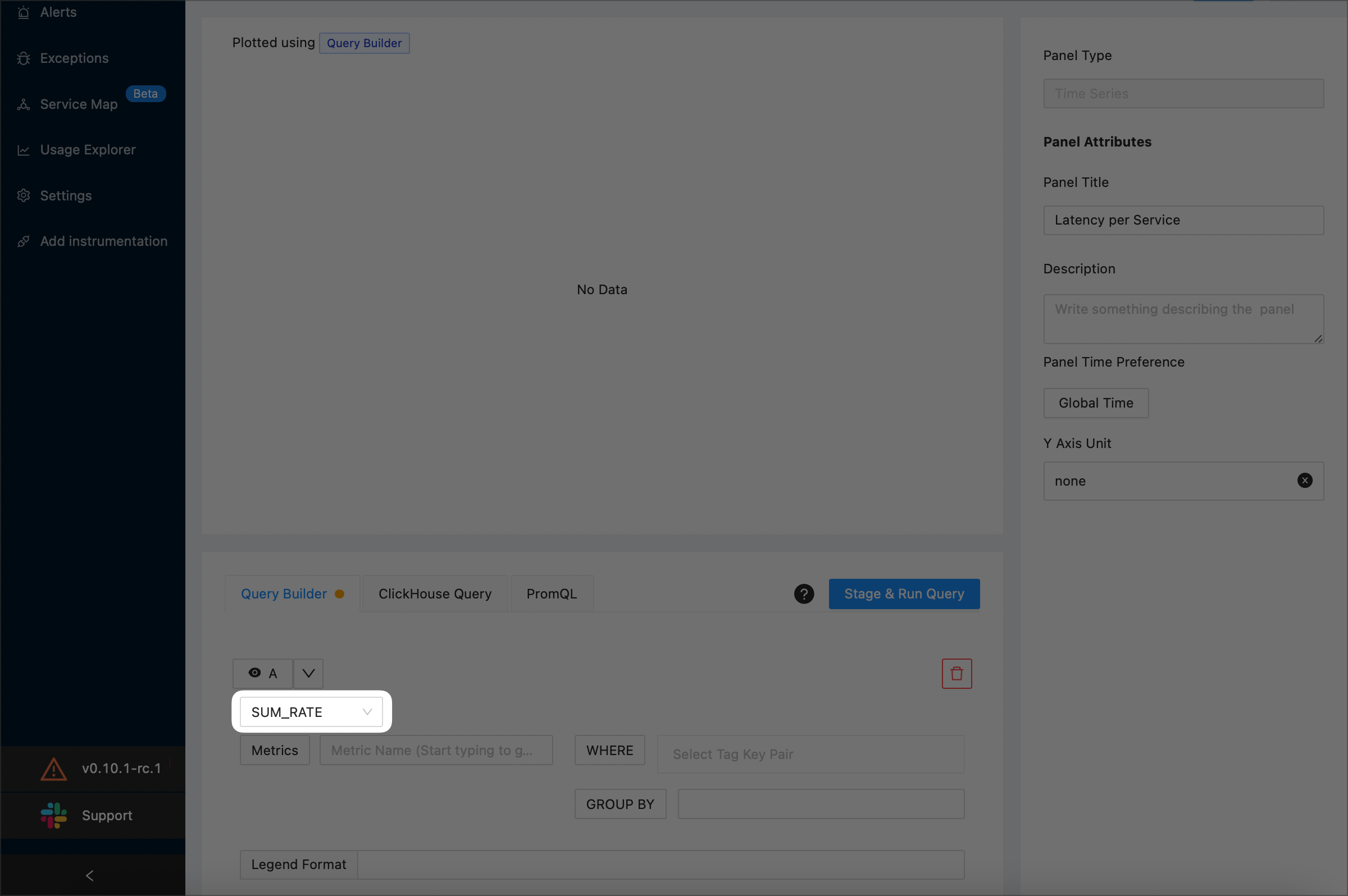
NOTE:
For details on aggregate functions, see the Aggregate Function section.
3.2 Use the Metrics drop-down to specify that you want to plot the latency of your application’s requests. The example screenshot below plots the total latency for SigNoz:
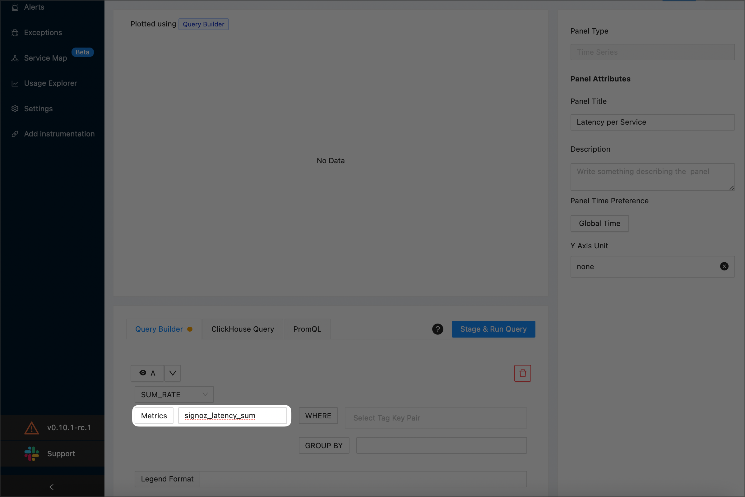
3.3 Indicate that you want to plot the a separate graph each service, by specifying
service_namein the Group By drop-down: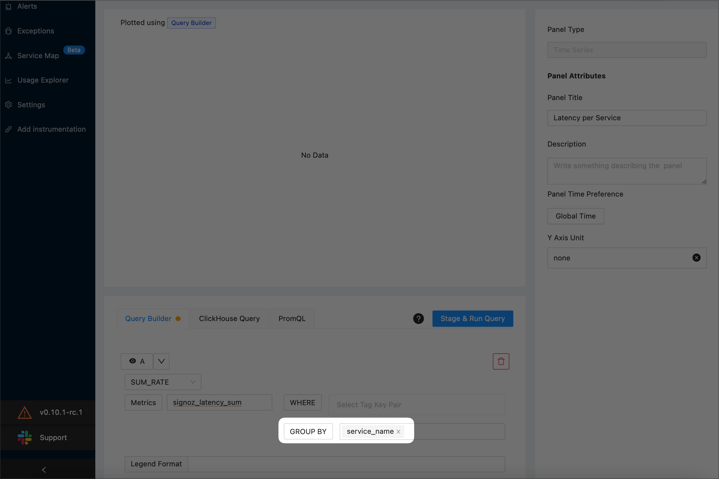
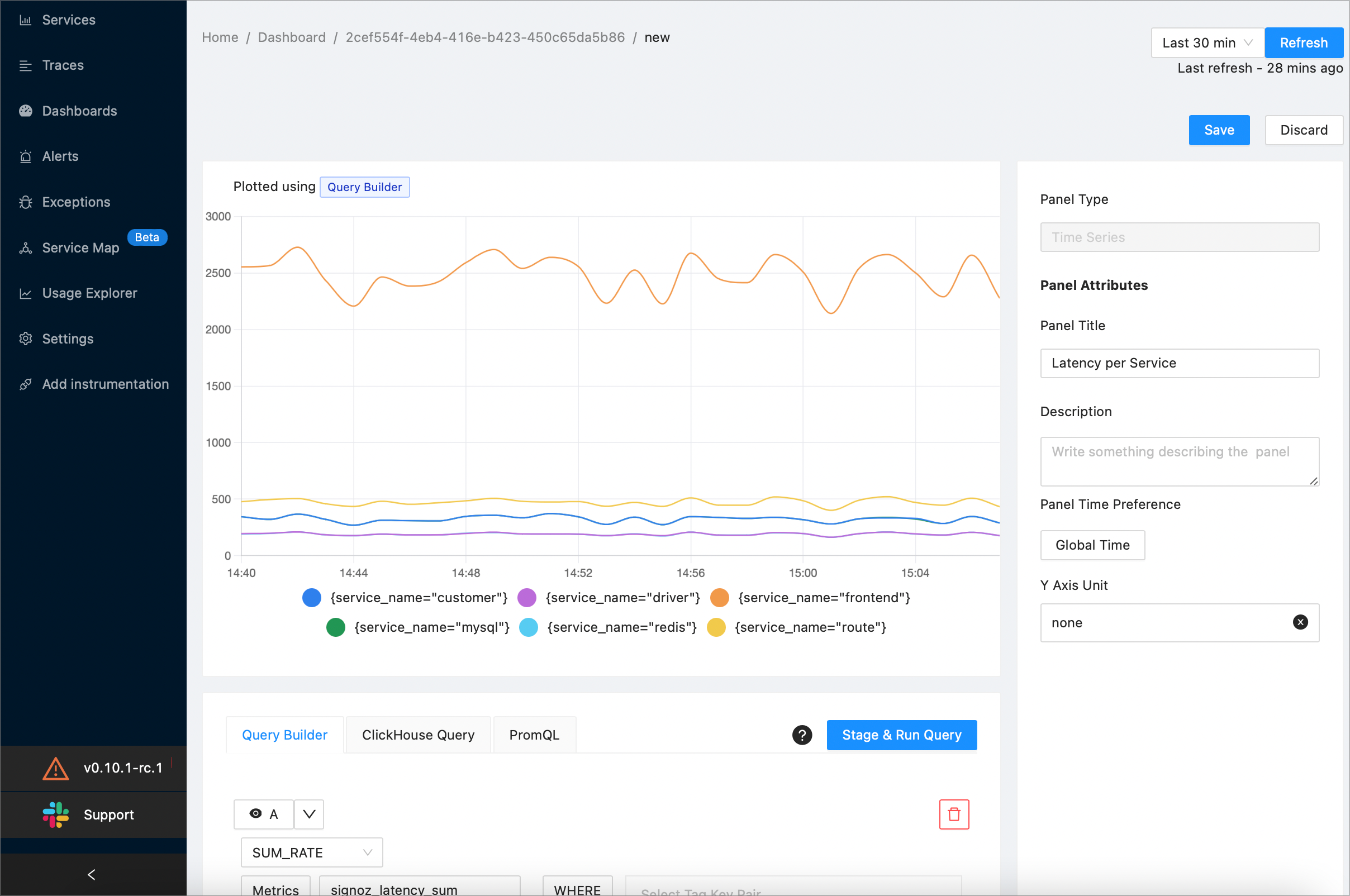
3.4 To preview your query, select the Stage & Run Query button. SigNoz will plot a graph similar to the following one:
Specify the Second Query (B)
4.1 To add a new query, select the +Query button.
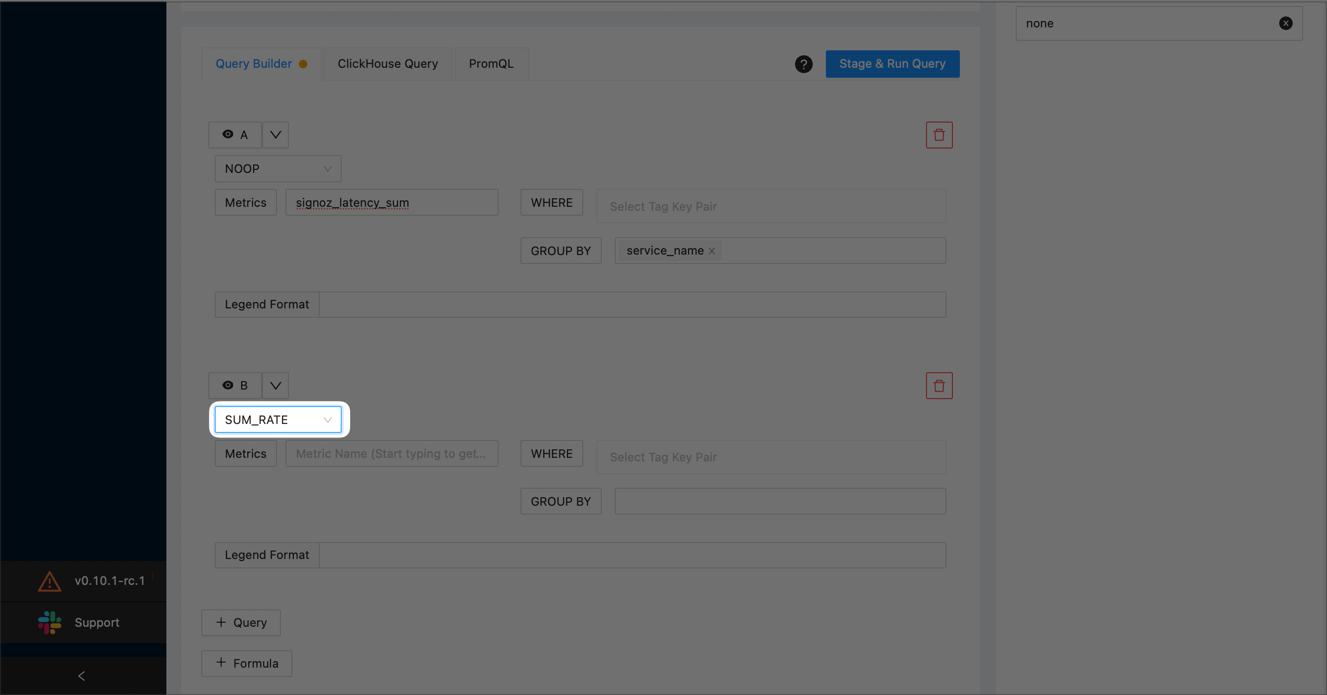
4.2 Under B, choose
SUM_RATEas the aggregate function:4.3 To preview your query, select the Stage & Run Query button. SigNoz will plot a graph similar to the following one:
NOTE:
For details on aggregate functions, see the Aggregate Function section.
4.4 Indicate that you want to plot the a separate graph each service, by specifying
service_namein the Group By drop-down: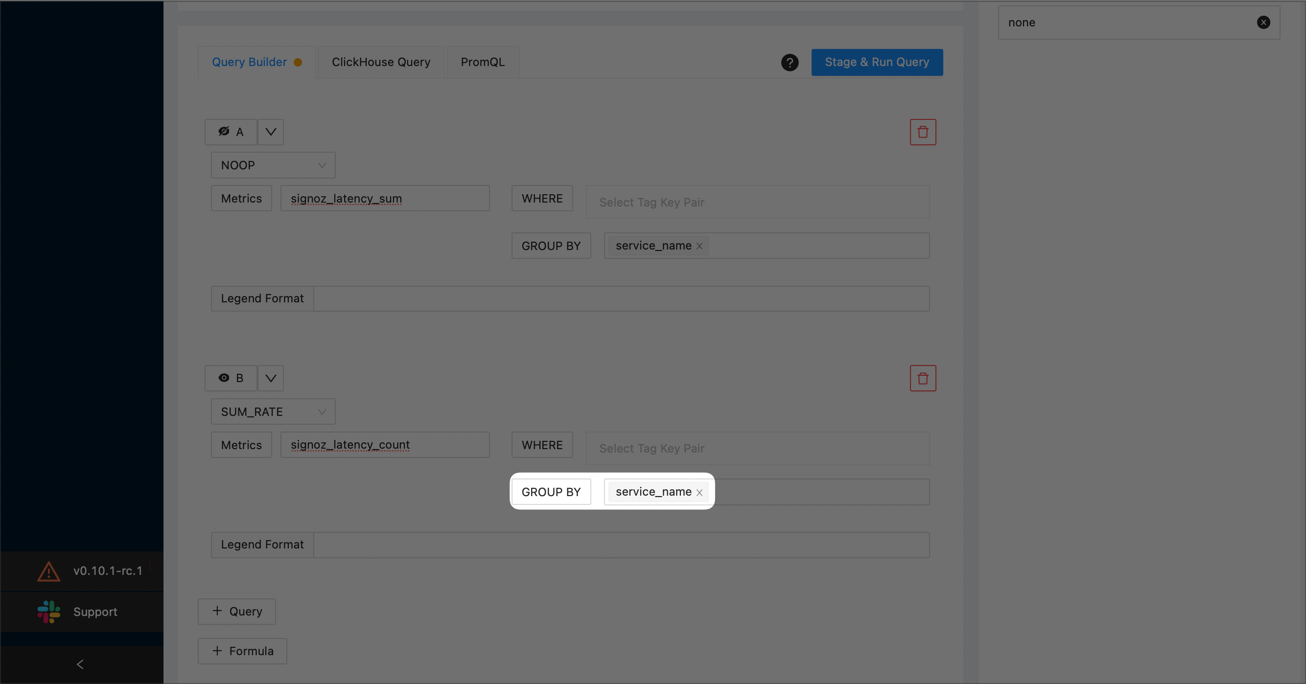
Hide A and B by selecting the corresponding eye icons:
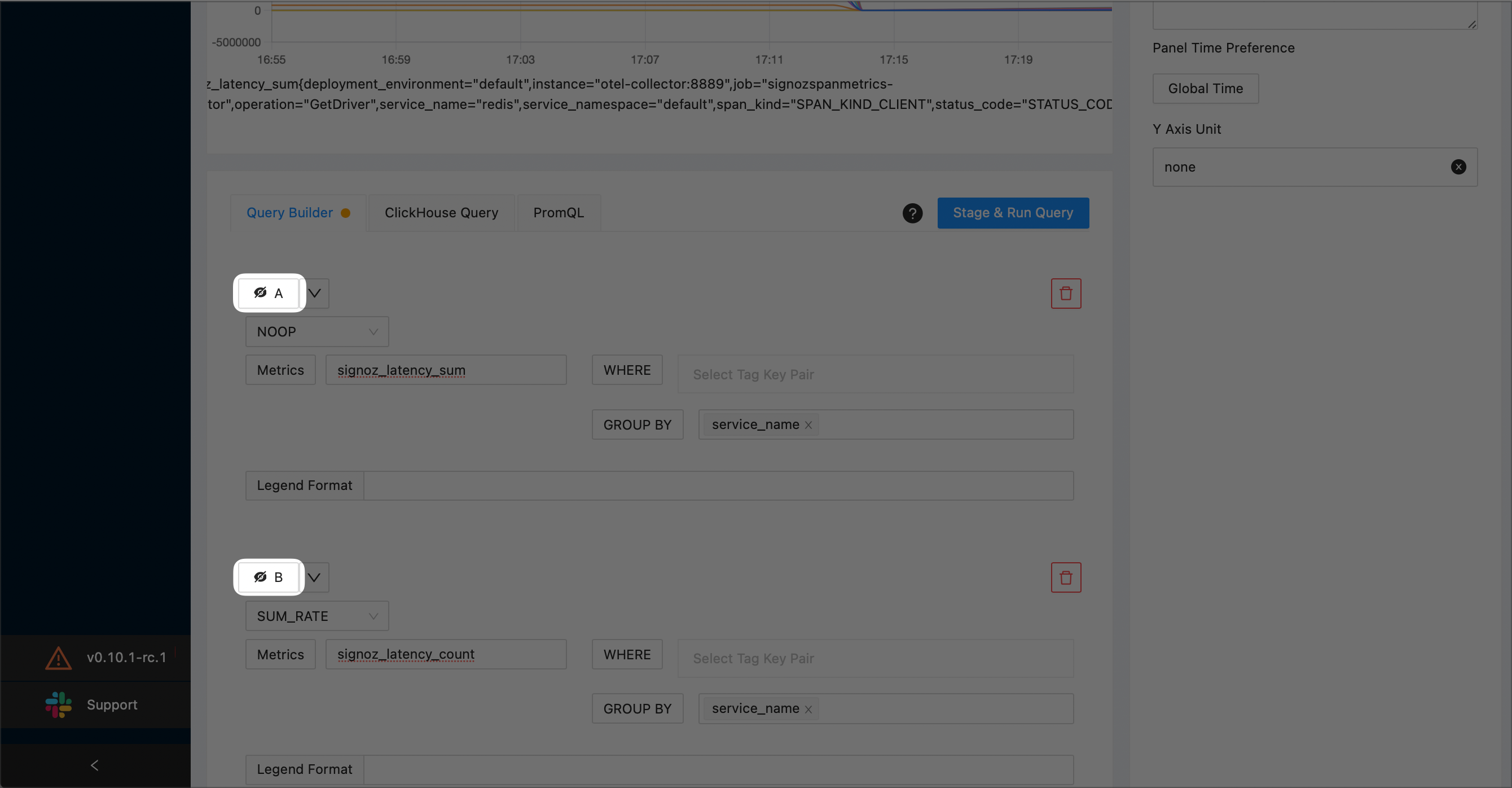
Create a function that calculates
A/Bby selecting the +Formula button and enteringA/Bin the text box: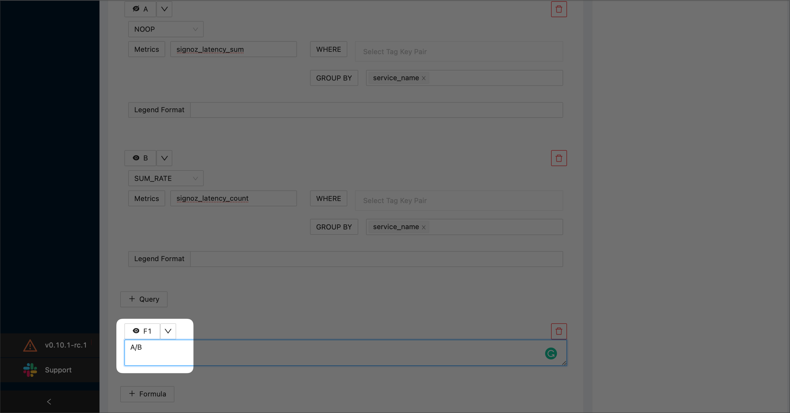
Select the Stage & Run Query button to preview your graph.
When you’ve finished, select the Save button at the top right corner of the screen. Then, select the OK button to confirm.
Error Rate per Service
This example plots the error rate per service using a formula based on two queries.
On a new or existing dashboard select the Add Panel button. Then, select Time Series:

Enter the title of your new panel. The example screenshot creates a new panel named “Error rates per service”:
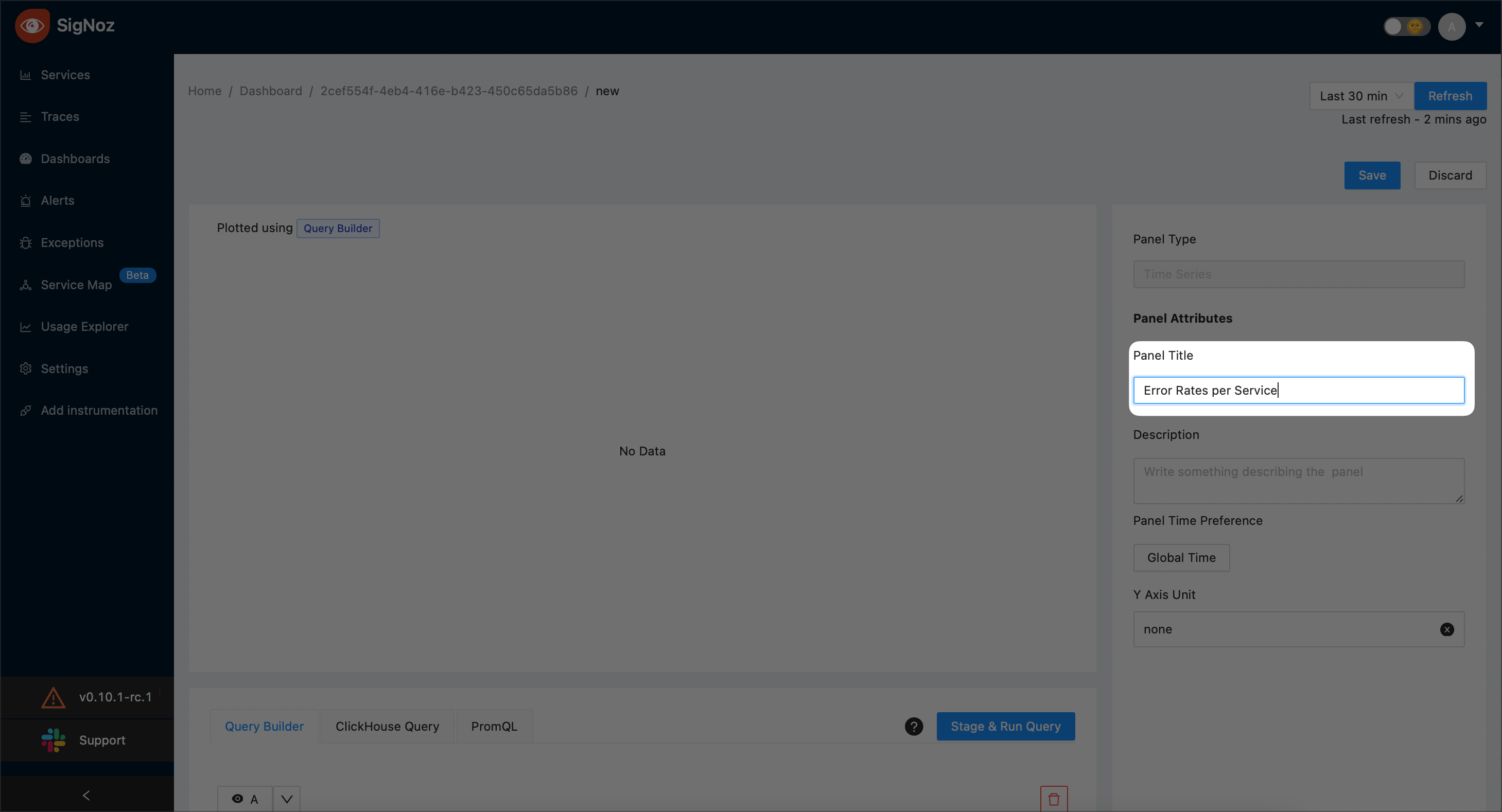
Specify the First Query (A)
3.1 Choose
SUM_RATEas the aggregate function: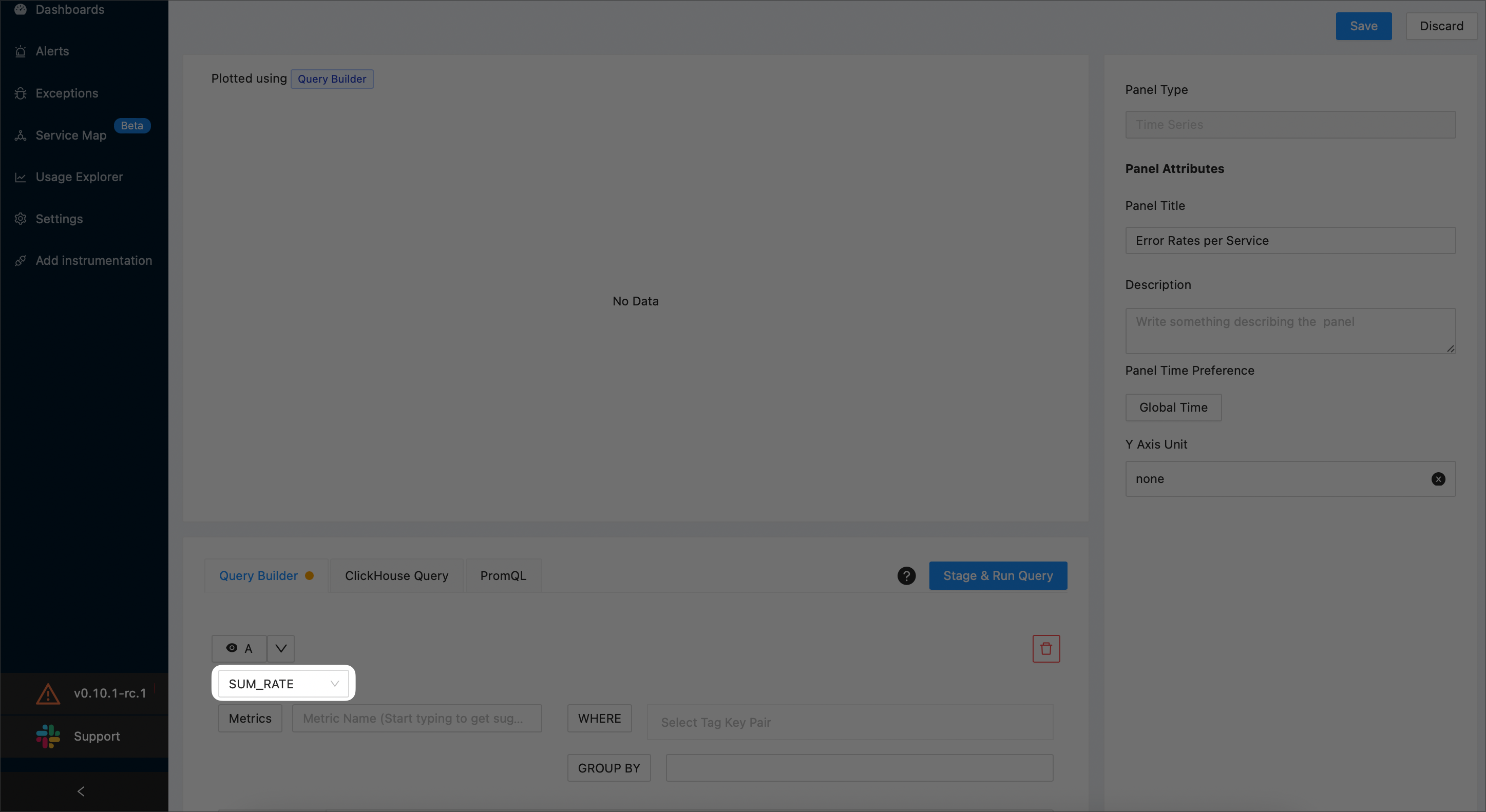
NOTE:
For details on aggregate functions, see the Aggregate Function section.
3.2 Use the Metrics drop-down to specify that you want to plot the total number calls for your application. The example screenshot below plots the total number of calls for SigNoz:
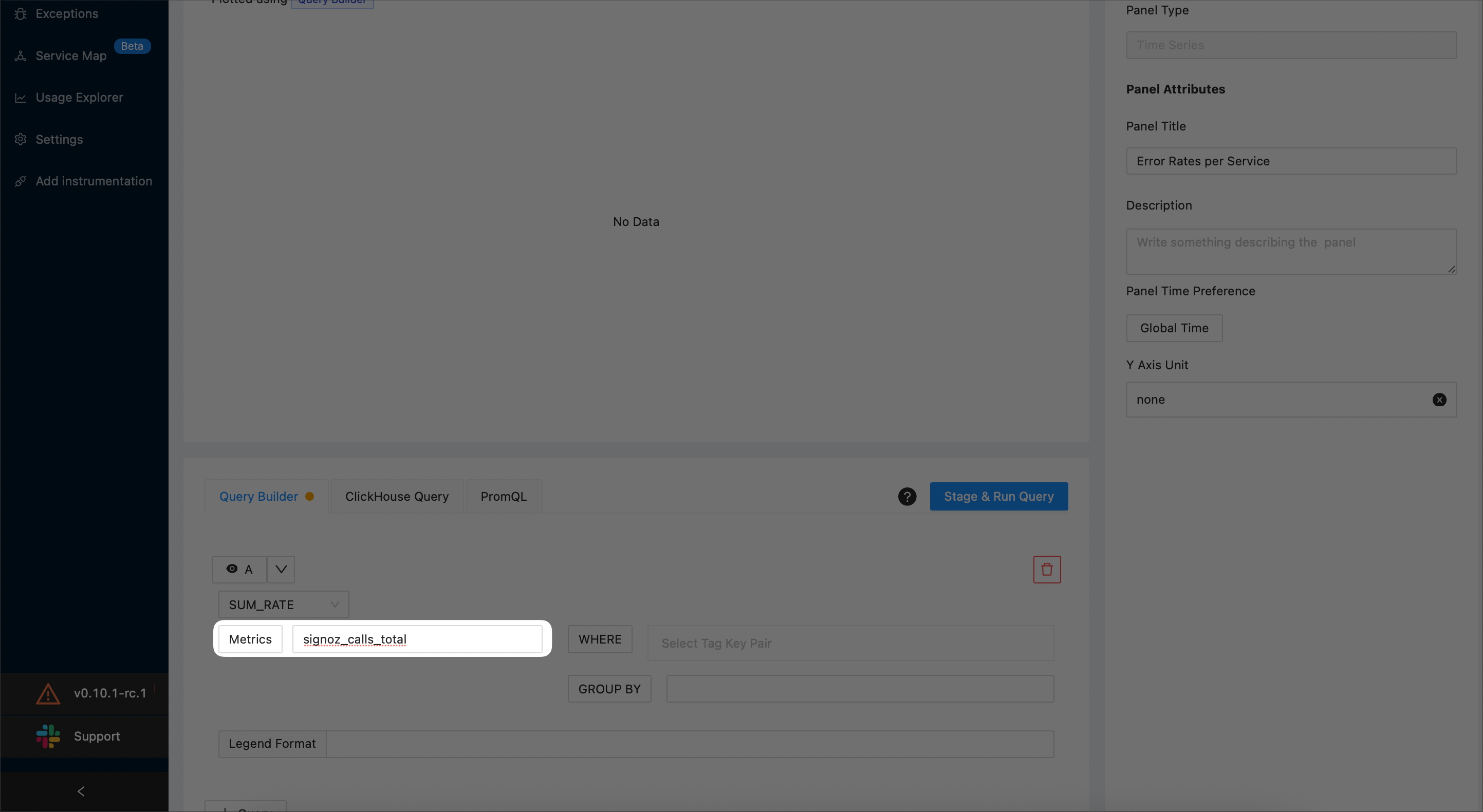
3.3 Specify that the you want to plot only the calls that failed by adding a filtering condition as shown below:

3.4 To plot a particular service add a new
WHERE clause. The following example plots a service namedredis:
Specify the Second Query (B)
4.1 To add a new query, select the +Query button.
4.2 Choose
SUM_RATEas the aggregate function: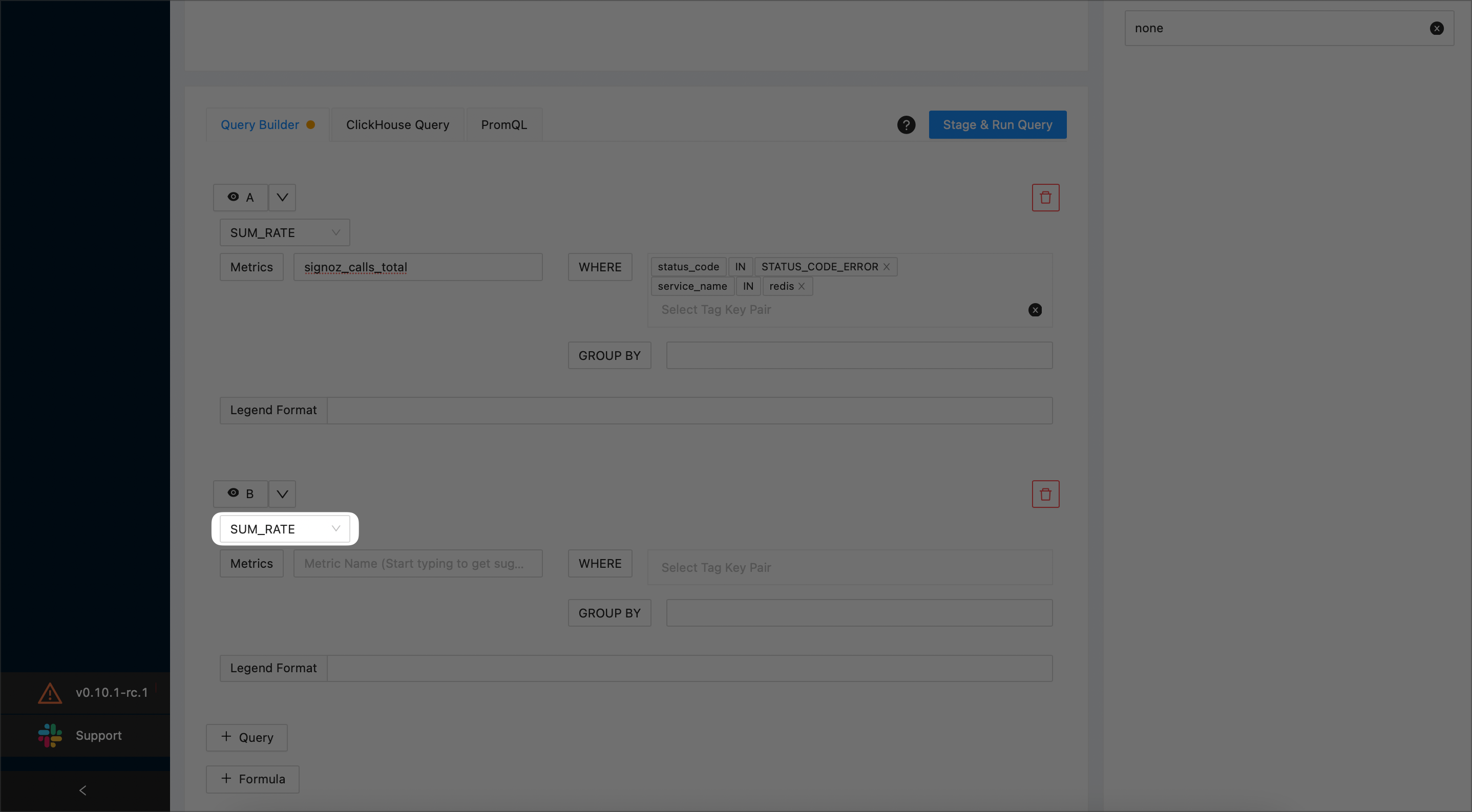
4.3 Use the Metrics drop-down to specify that you want to plot the total number calls for your application. The example screenshot below plots the total number of calls for SigNoz:
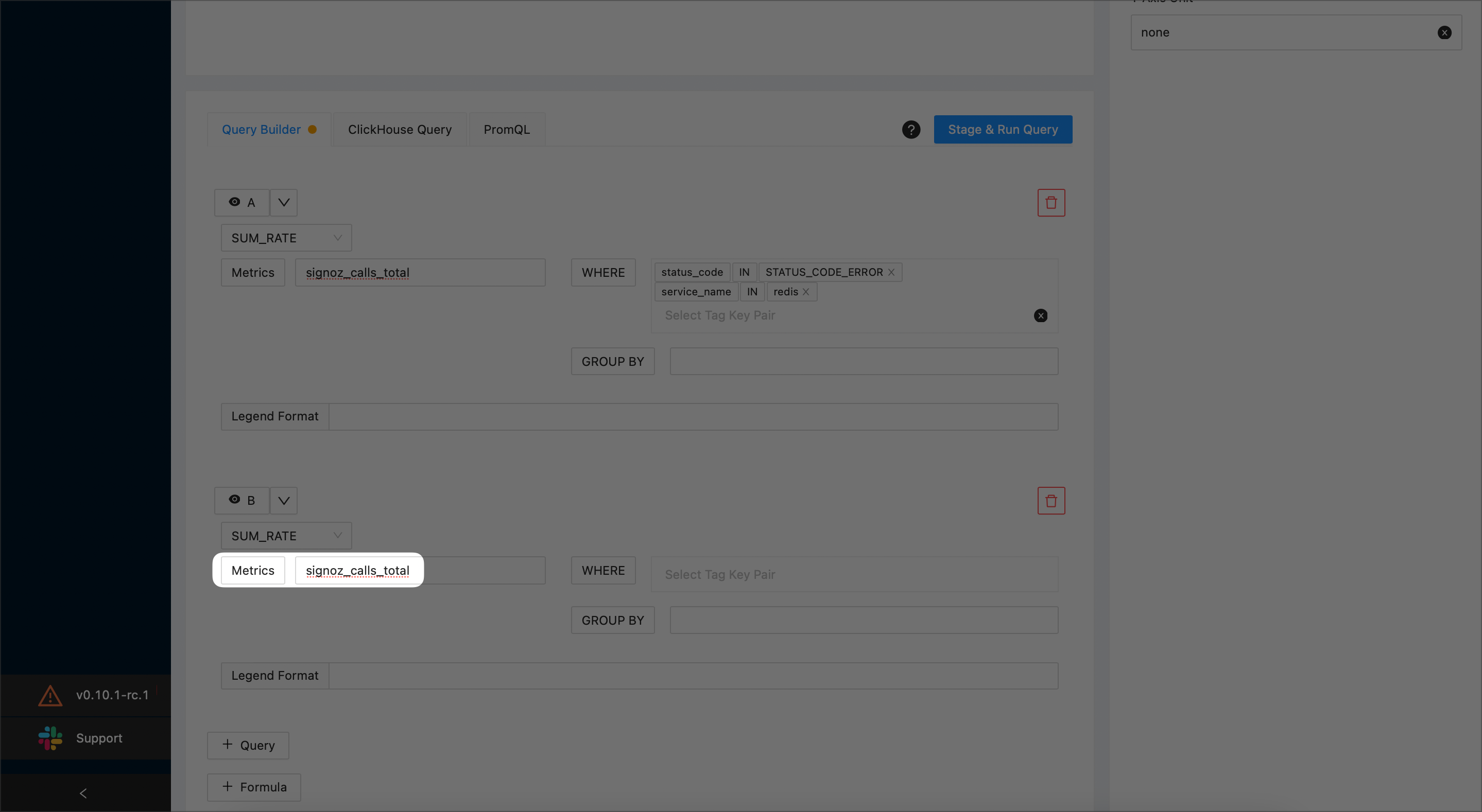
4.4 Indicate that the you do not want to plot the calls for the service you’ve previously specified (
redis):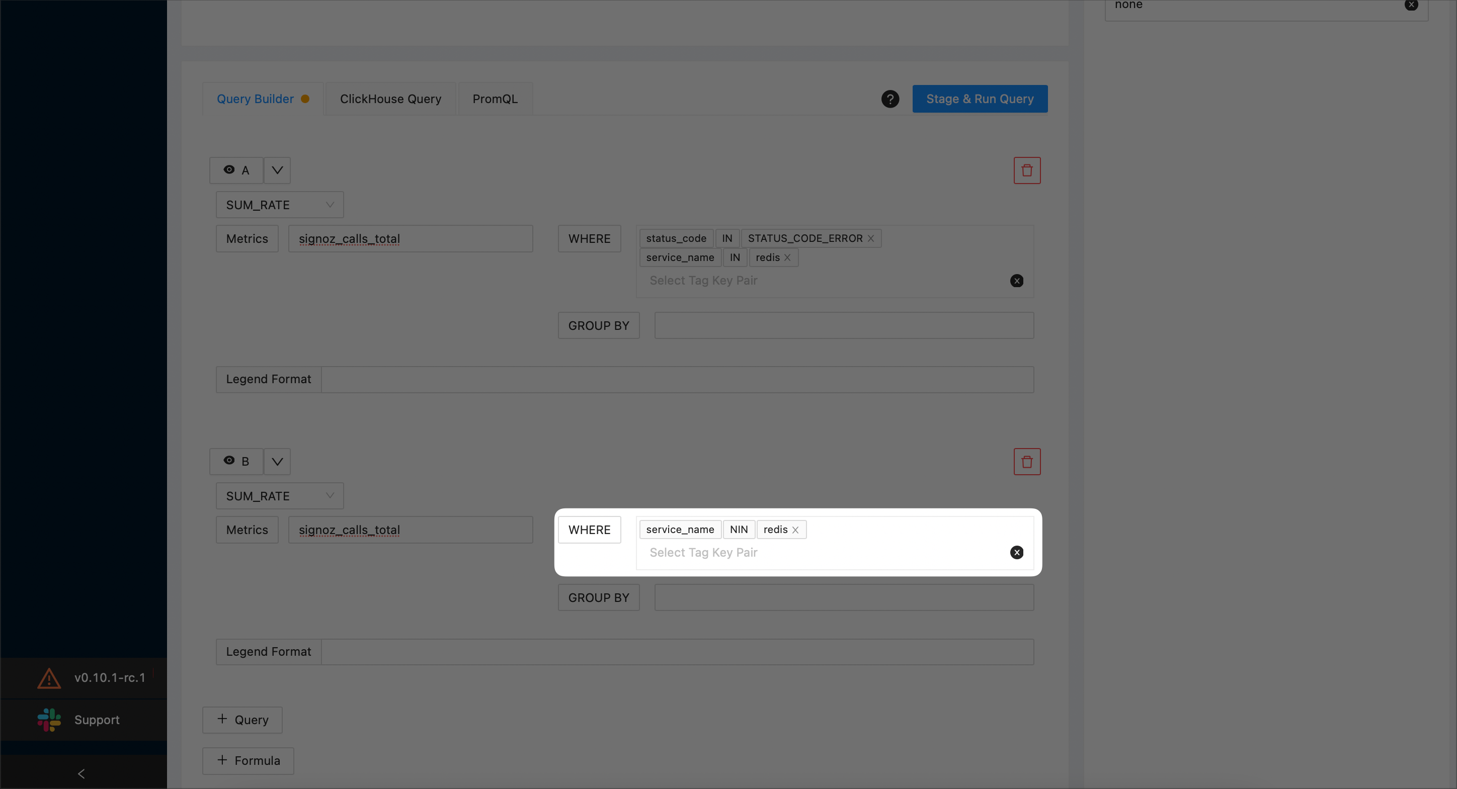
Hide A and B by selecting the corresponding eye icons:
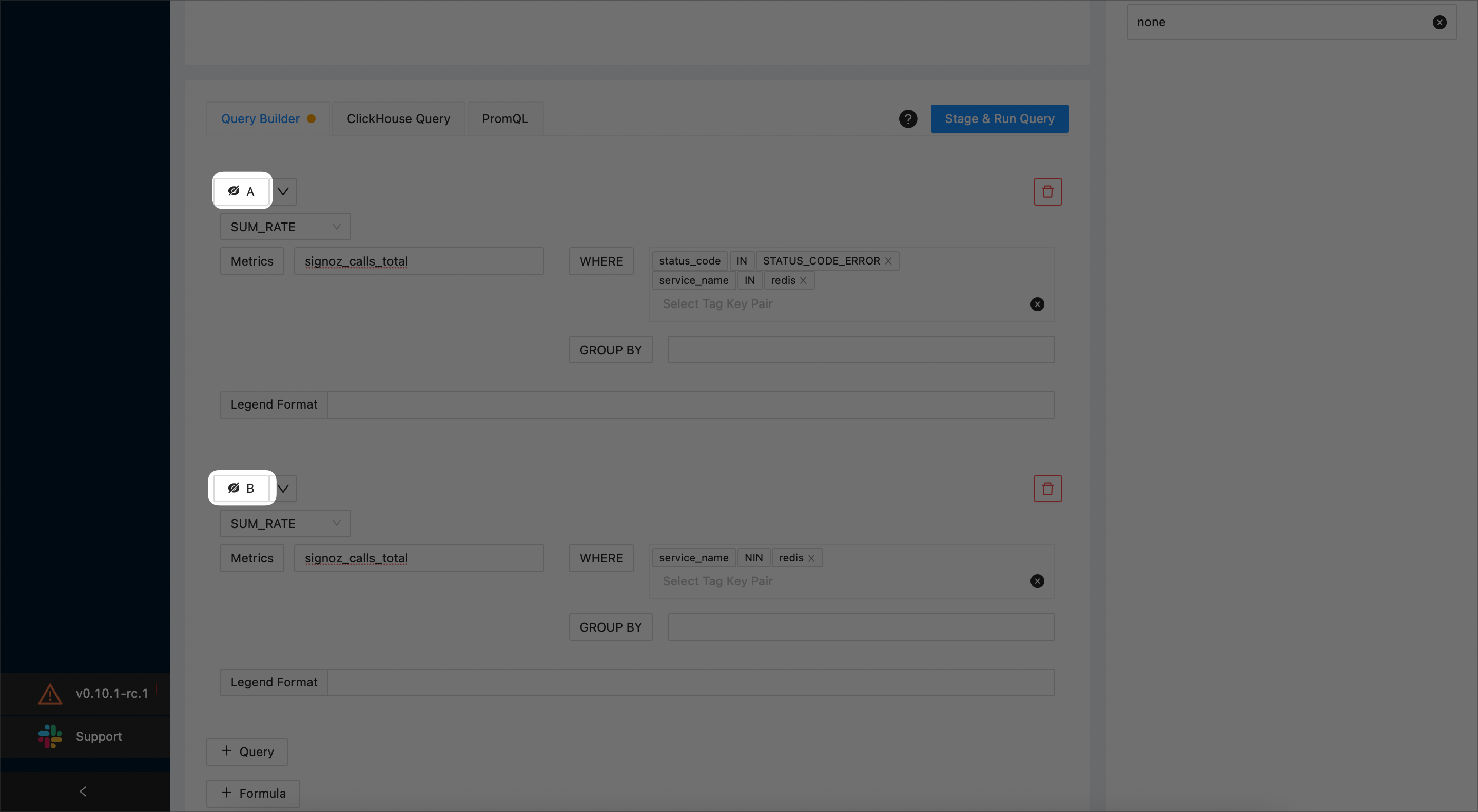
Create a function that calculates
A/Bby selecting the +Formula button and enteringA/Bin the text box: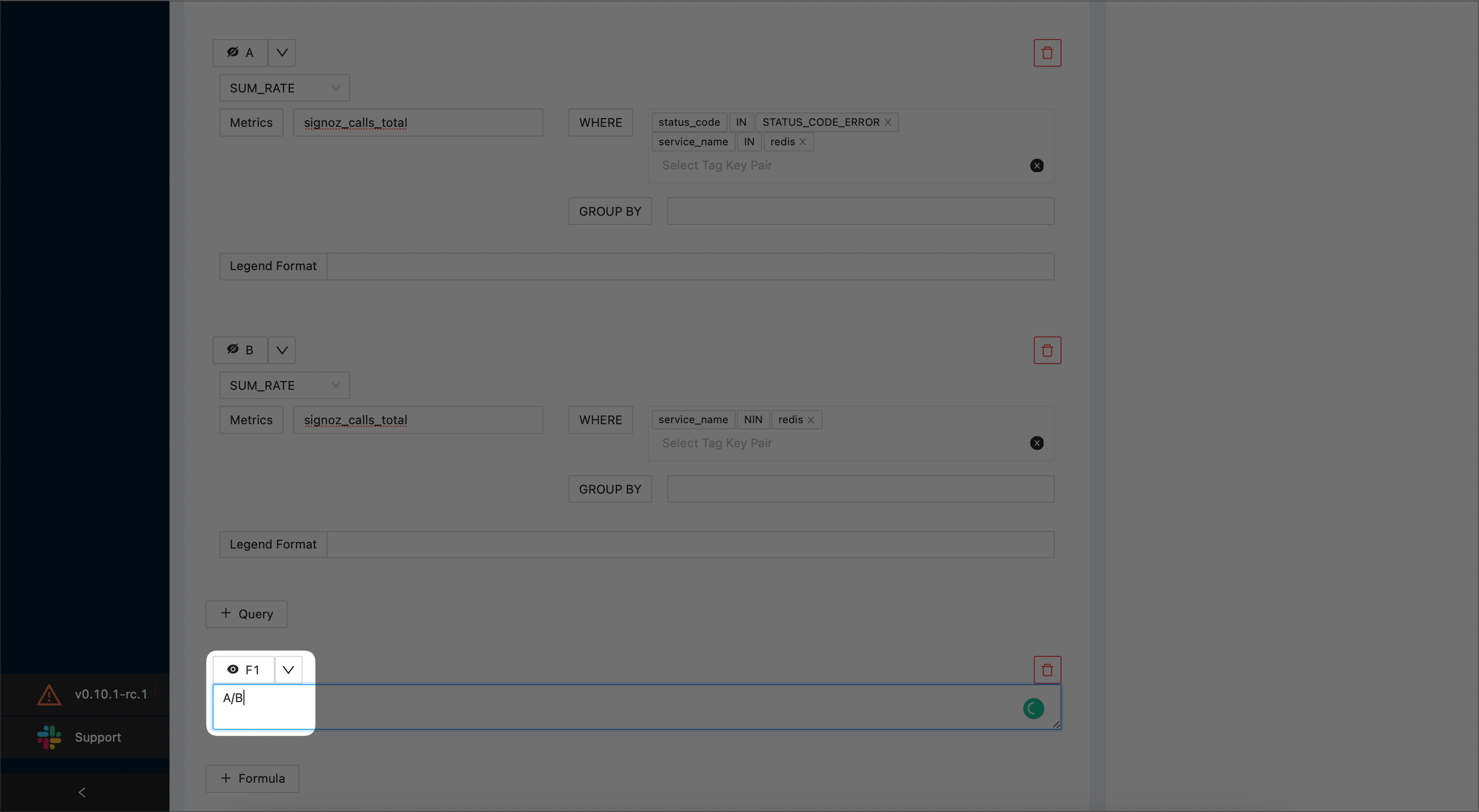
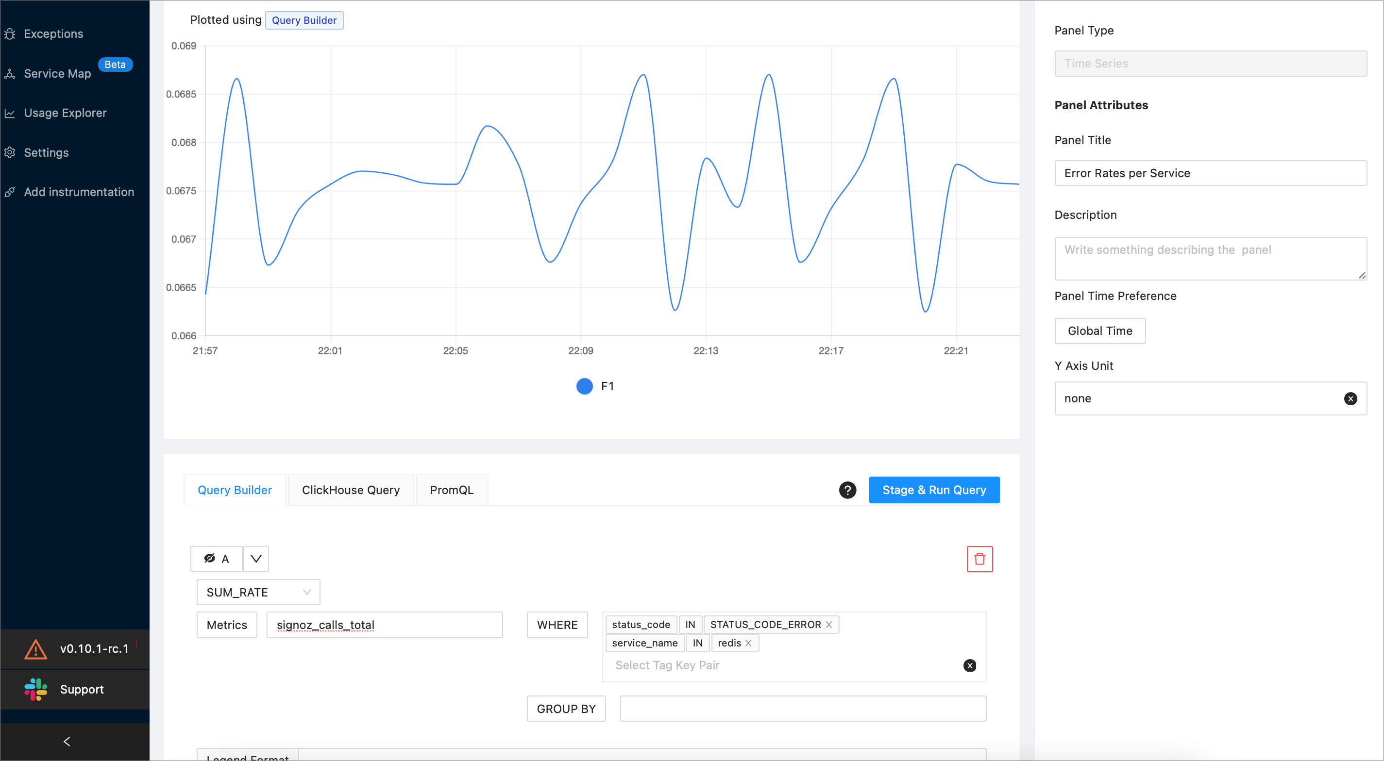
Select the Stage & Run Query button. SigNoz will plot a graph similar to the following one:
When you’ve finished, select the Save button at the top right corner of the screen. Then, select the OK button to confirm.